
Tiara Delight
Brief
Due to the COVID-19 outbreak, customers lean toward QR-based ordering and payment. Waiters/waitresses are required to only deliver food and take orders from a distance.
Solution
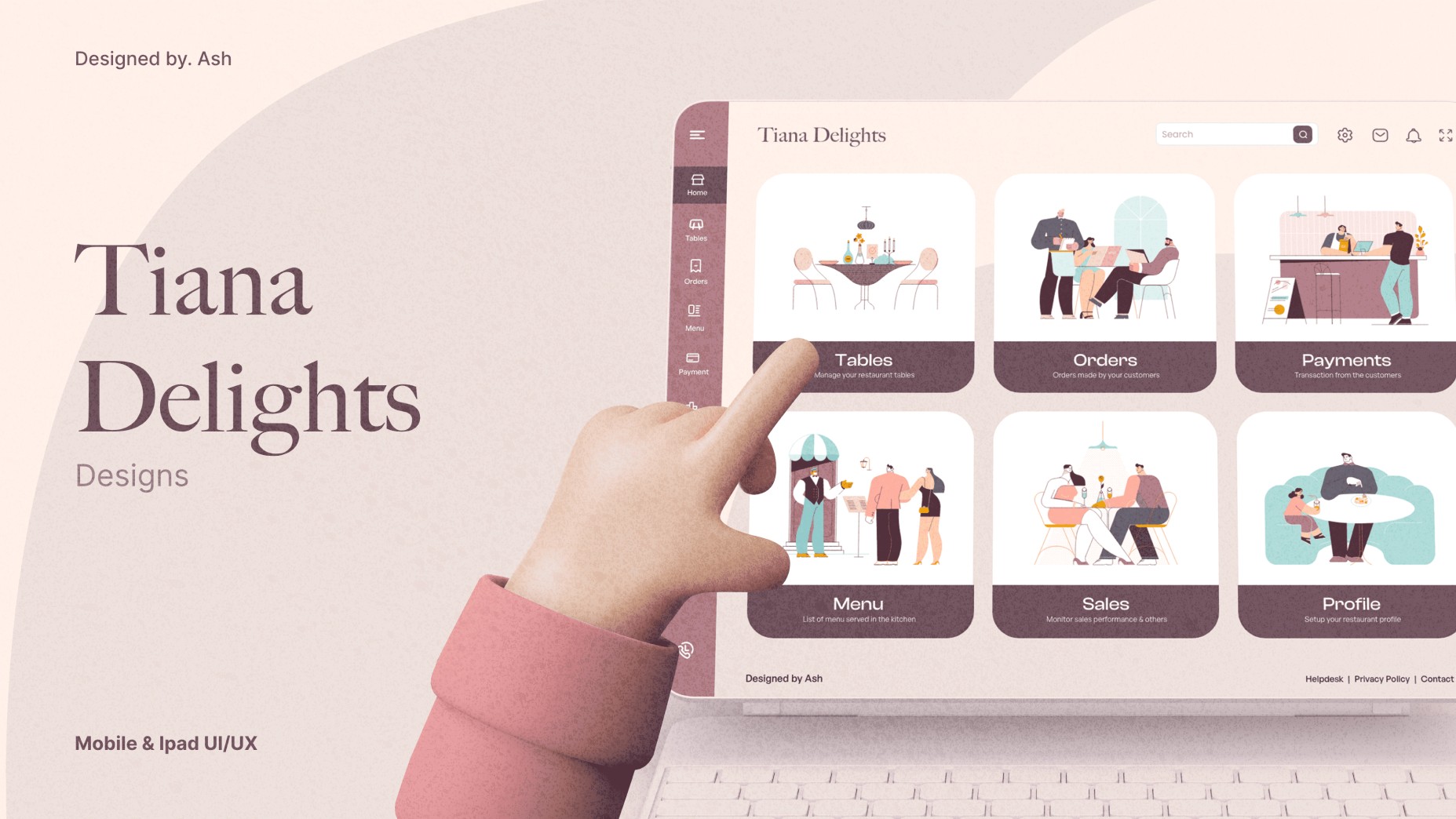
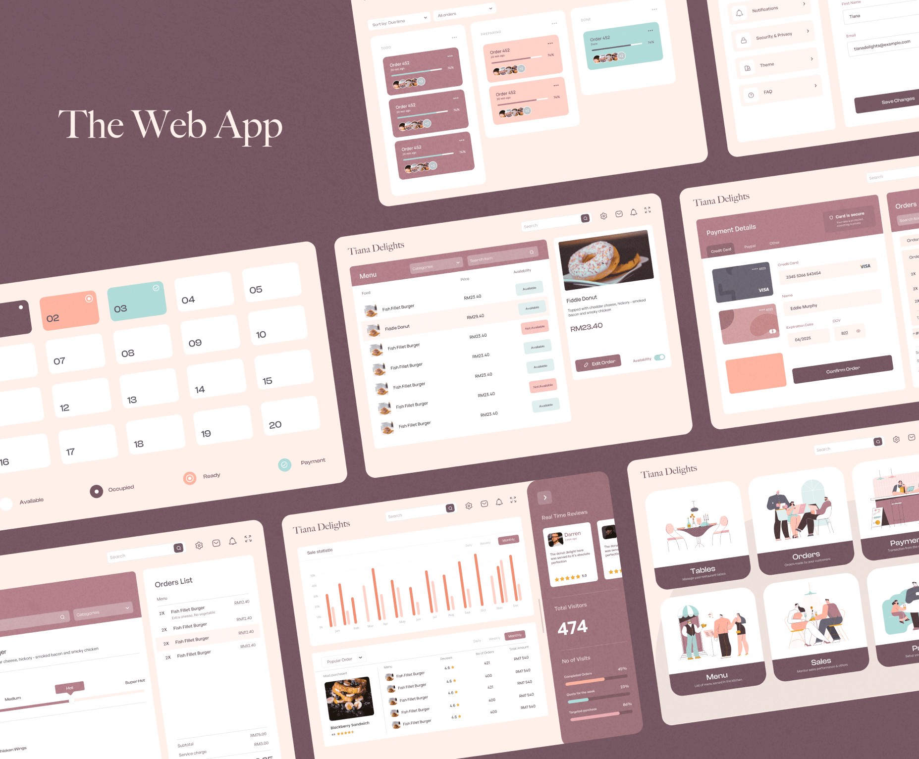
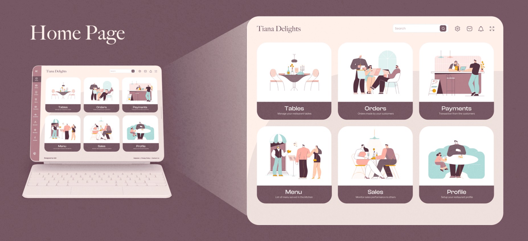
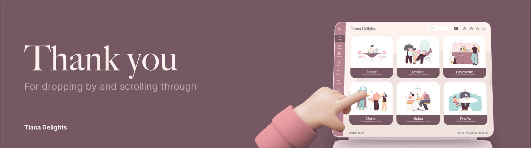
Tiana Delight is a tab application developed for restaurant branches that take orders for food and beverages from customers, track sales, provides analytics, and shows required in a single and flexible dashboard.
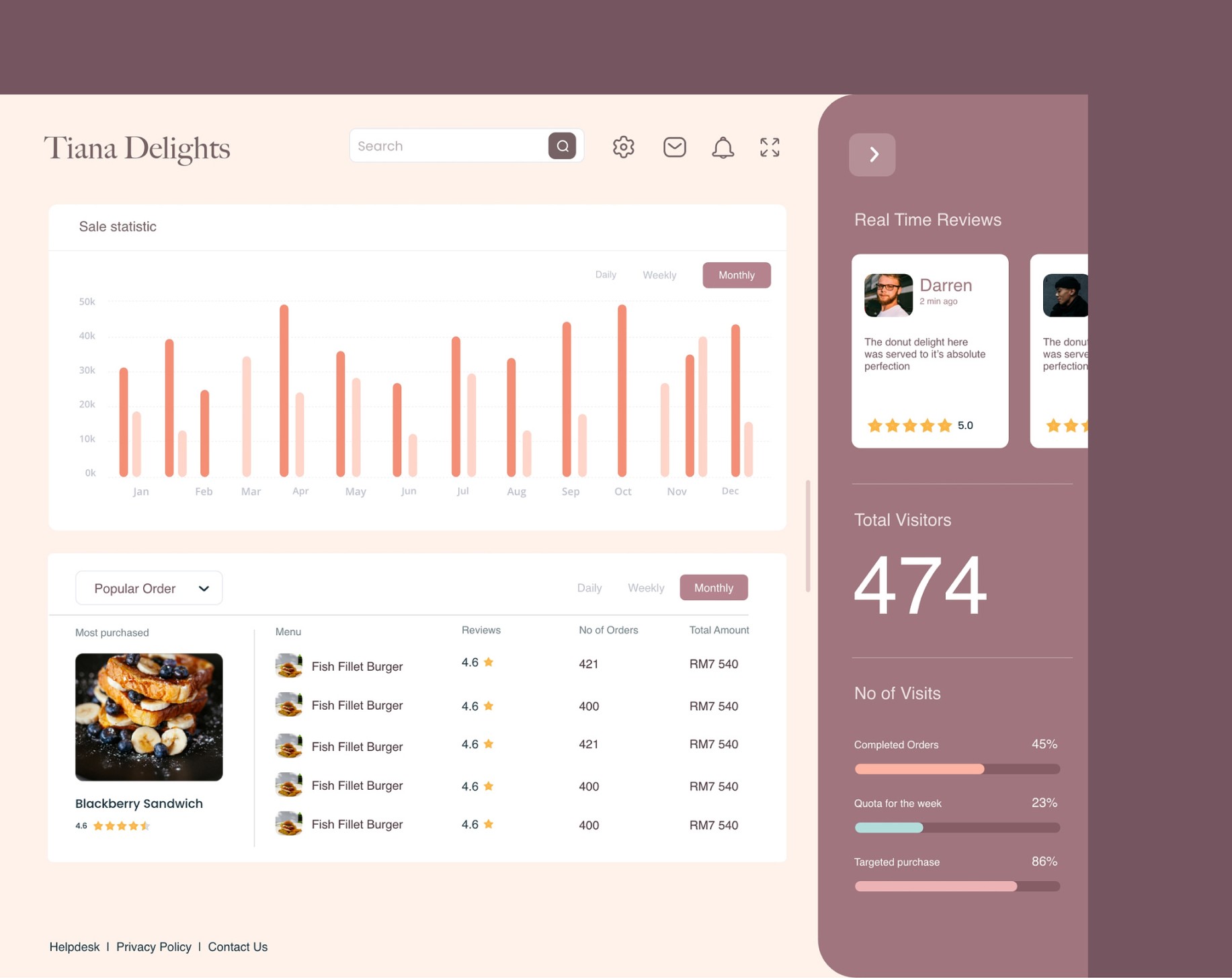
Tiana Delight provides an easy-to-navigate payment for customers and admin for the restaurant.
Typography
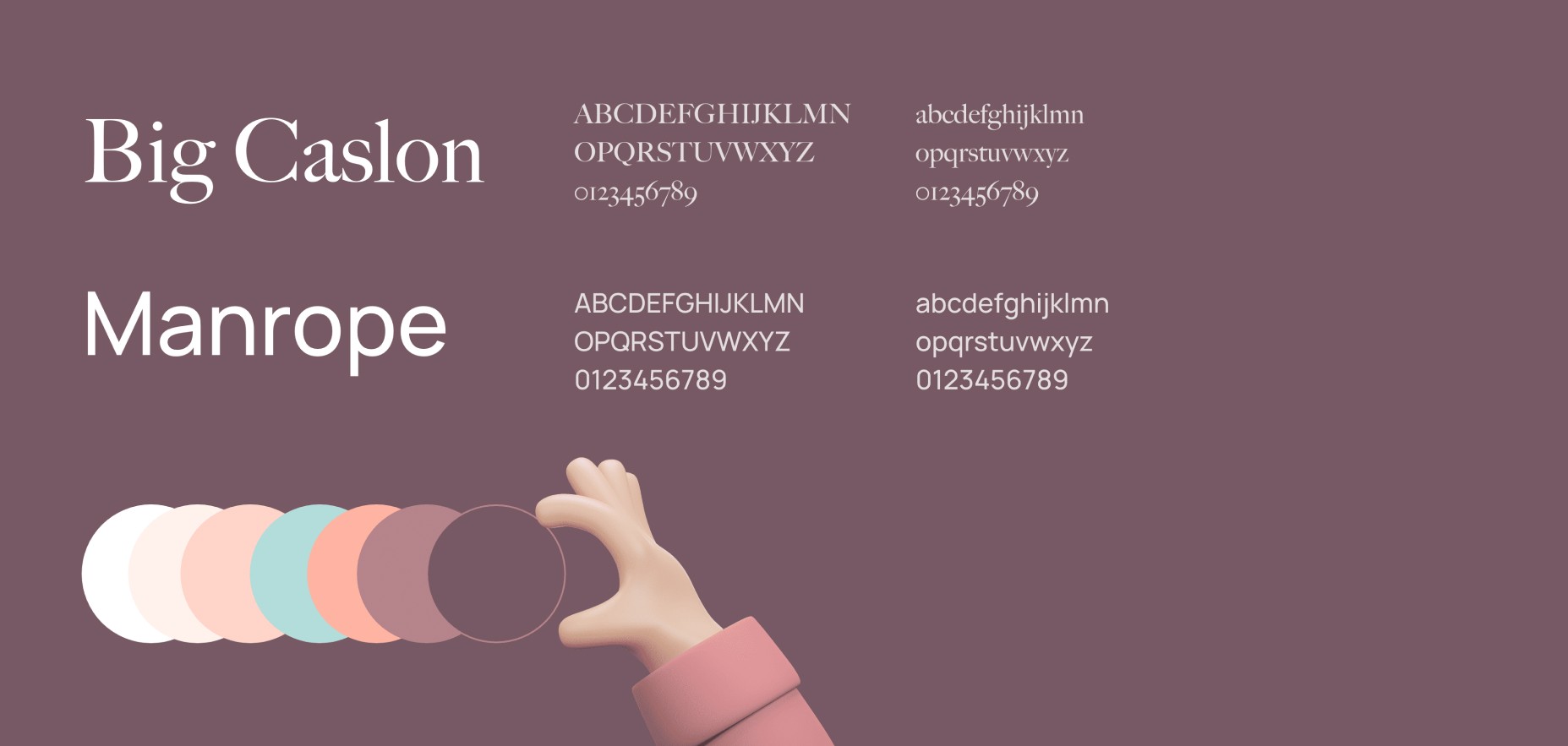
Big Caslon is characterized by the small lines or "feet" attached to the ends of the letters, which can help to draw the eye to the text and make it more legible at larger sizes. Big Caslon also adds a sense of sophistication and formality to a design. This can be especially useful for headings, which are often used to highlight important information or draw the reader's attention to a specific section of content.
In addition to their aesthetic appeal, Manrope can also be more legible on smaller screens, such as those found on smartphones and tablets. The lack of serifs can make the letters easier to read at small sizes, which can be especially important for apps where users may need to quickly scan and comprehend large amounts of text.
Colors
Muted and minimal colors, such as peach and light pink, can be good choices for app design because they can create a calm and relaxing atmosphere. These colors tend to be softer and more subdued than bright and bold hues, which can help to reduce visual clutter and create a sense of simplicity and clarity.
Main Menu
Providing a big card view that graphics for the most crucial sections of the app so it is easy to navigate for the users.
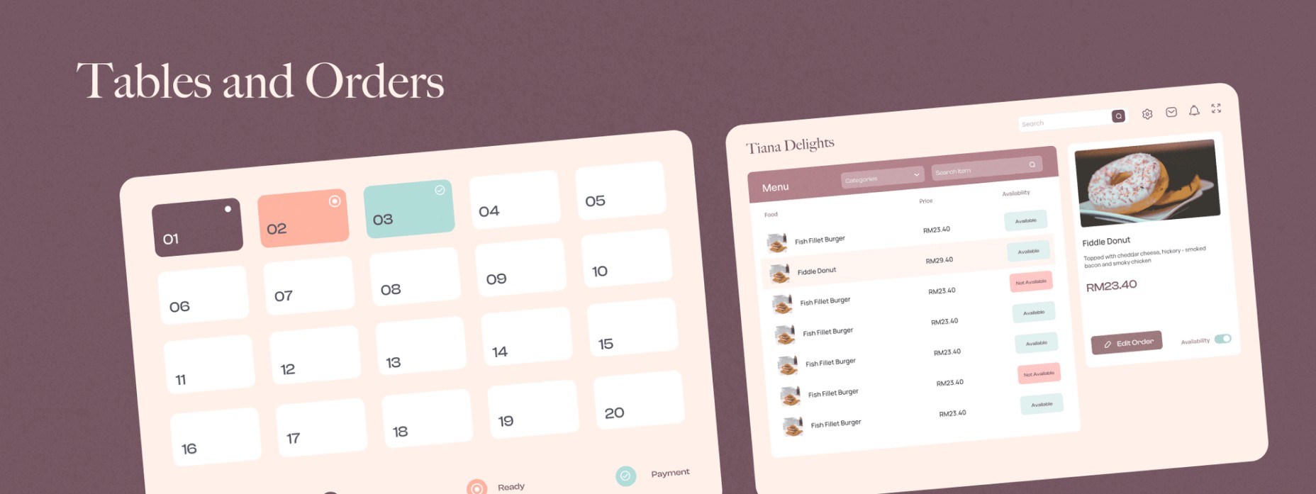
Tables
Number tables to indicate each table, color coded for each status for the customer of the restaurant.
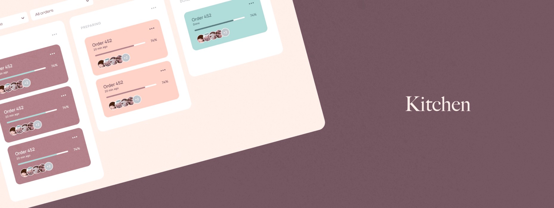
Kanban Board
This part of the app is displayed in the kitchen. As the chef creates the food accordingly. A Kanban board helps the chefs track the progress of their work. It is particularly useful for managing the flow of work and identifying bottlenecks in the process.
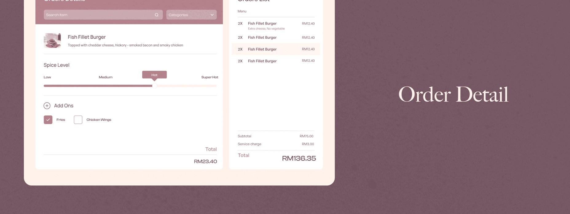
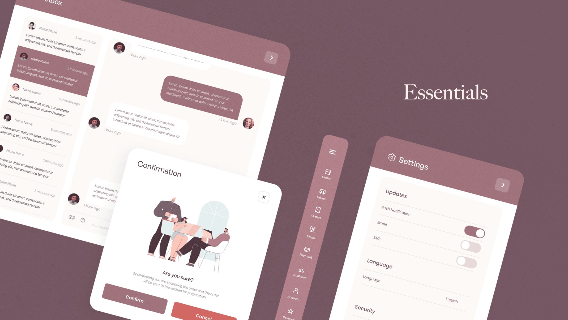
Modal
There are several ways in why a sidebar modal view is used in Tiana Delight
It can provide additional context or information: A sidebar modal view can be used to display additional information or options related to the main content, which can help users understand or interact with the content more effectively.
It can save screen space: By using a modal view, you can keep the main content visible while still providing access to additional options or information. This can be especially useful on small screens or in situations where screen real estate is limited.
It can reduce clutter: By separating the main content from the additional options or information, a sidebar modal view can help to reduce clutter and make the app easier to navigate.
It can improve the user experience: By providing users with access to additional options or information when needed, a sidebar modal view can enhance the user experience and make the app more flexible and user-friendly.
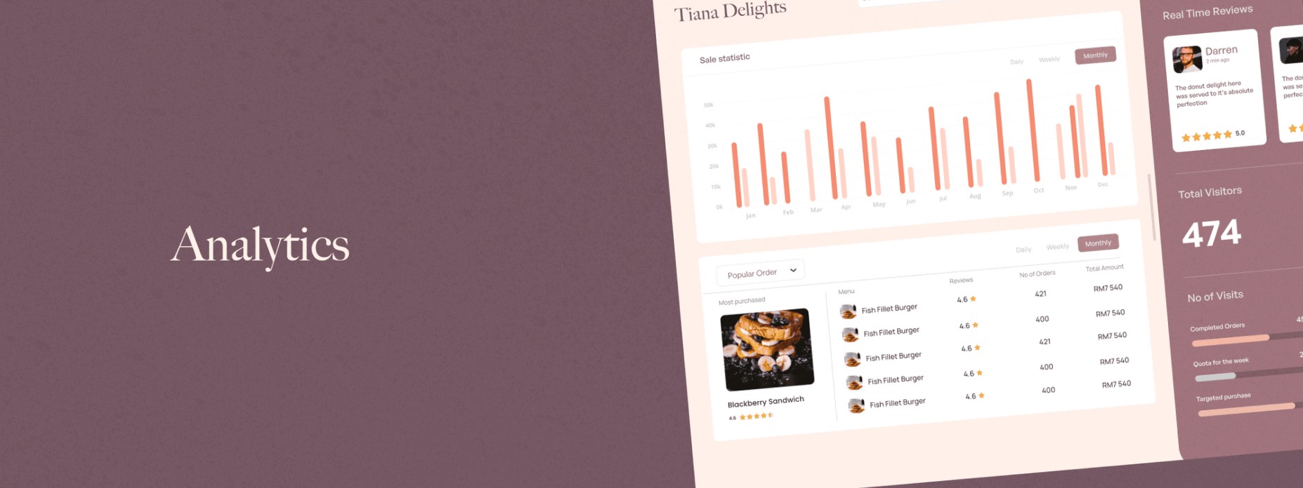
Analytic Dashboard
We created this for a couple of reasons
Customer behavior: The dashboard can provide insights into how customers are using the app, such as the most popular menu items, the frequency of orders, and customer demographics. This can help the restaurant understand its customers' needs and preferences and tailor their marketing and menu offerings accordingly.
Sales: The dashboard can track sales data, including revenue, average order value, and sales by location or time of day. This can help the restaurant identify trends and optimize its pricing and marketing strategies.
Operational efficiency: The dashboard can track metrics such as order turnaround time and delivery performance, helping the restaurant identify opportunities to streamline its operations and improve efficiency.
We also added real-time reviews, they can help a restaurant improve customer satisfaction, increase transparency, identify areas for improvement, and increase engagement with its customers.
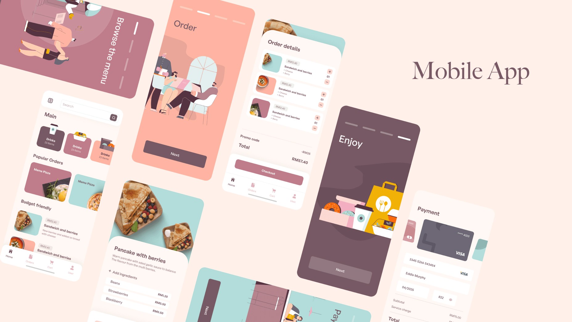
Mobile App
We also created a mobile for those who want to order food from home, with a discounted price incentive compared to using third-party apps like Uber Eats. Customer loyalty points will be rewarded to those who are the recurring customer.
Only10
Brief
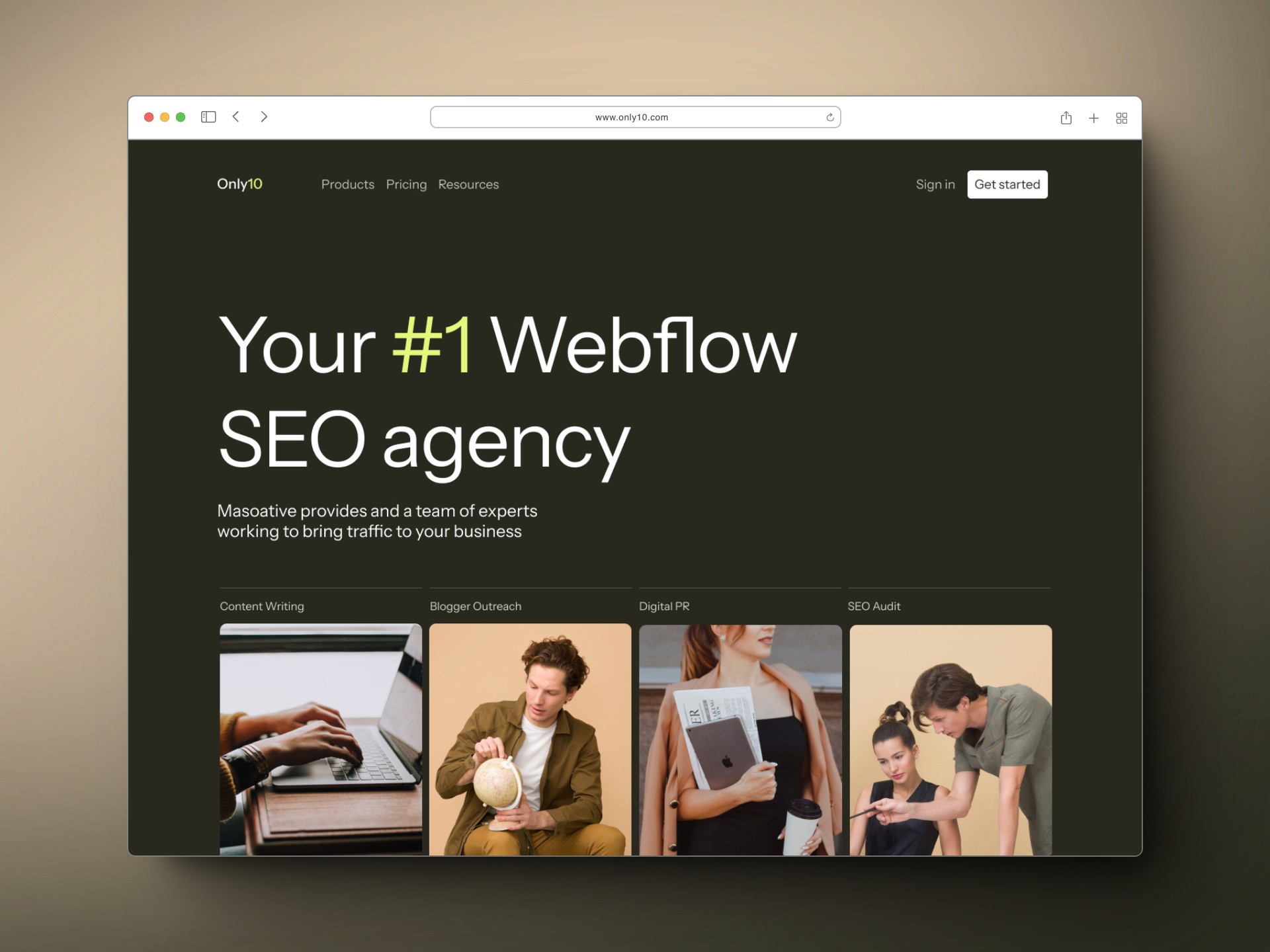
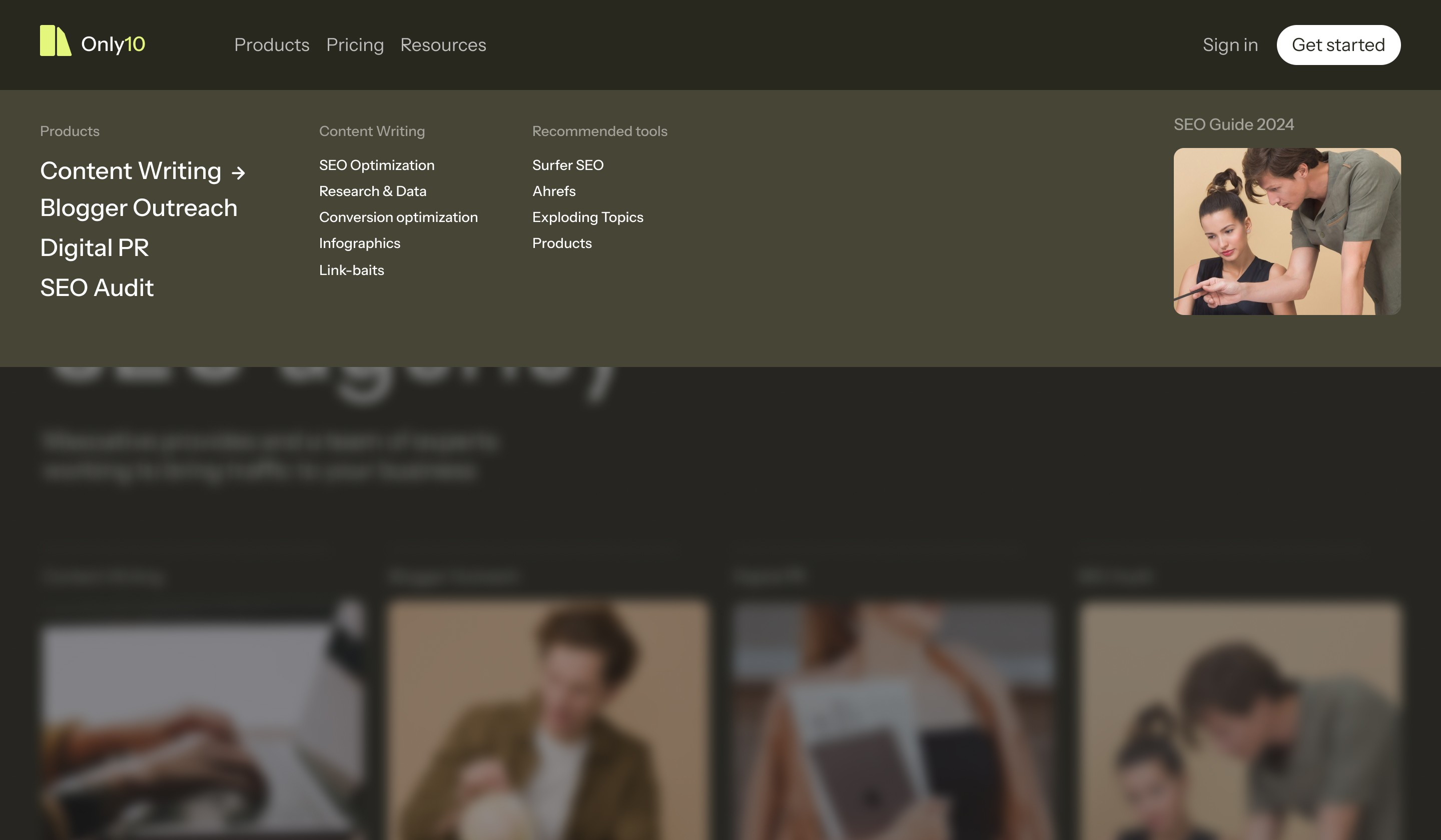
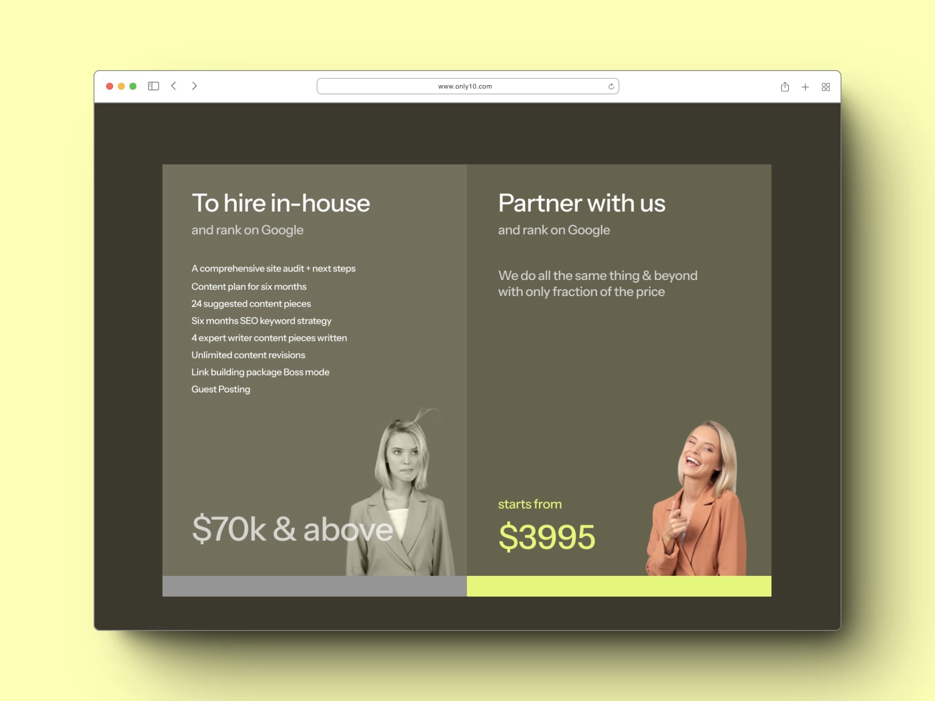
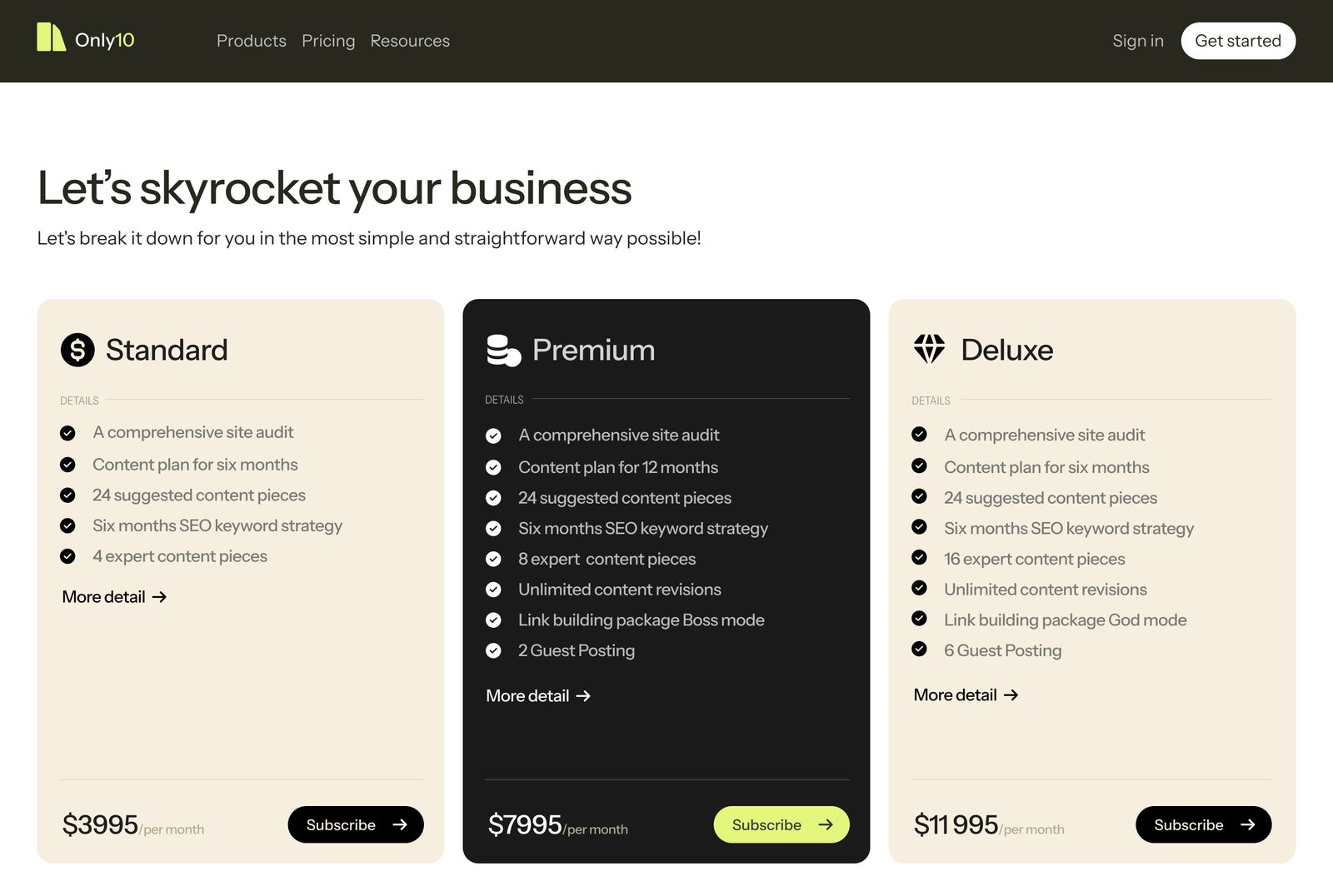
Only10, is a Webflow SEO Agency, that provides SEO as a service for Webflow hosted platforms. Their model is an all-in-one agency that does subscription model for the colective set SEO experts that works togethers which is typically much cheaper than hiring an in-house expert.
Solution
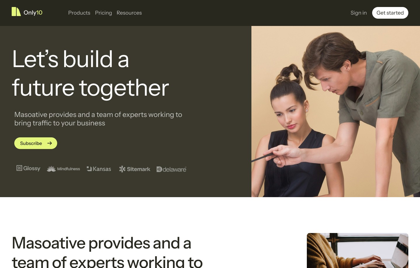
Since the target audience is B2B business, the aesthetics will be more professional and while providing the premium experience throughout the site, the site will be optimize for conversion.
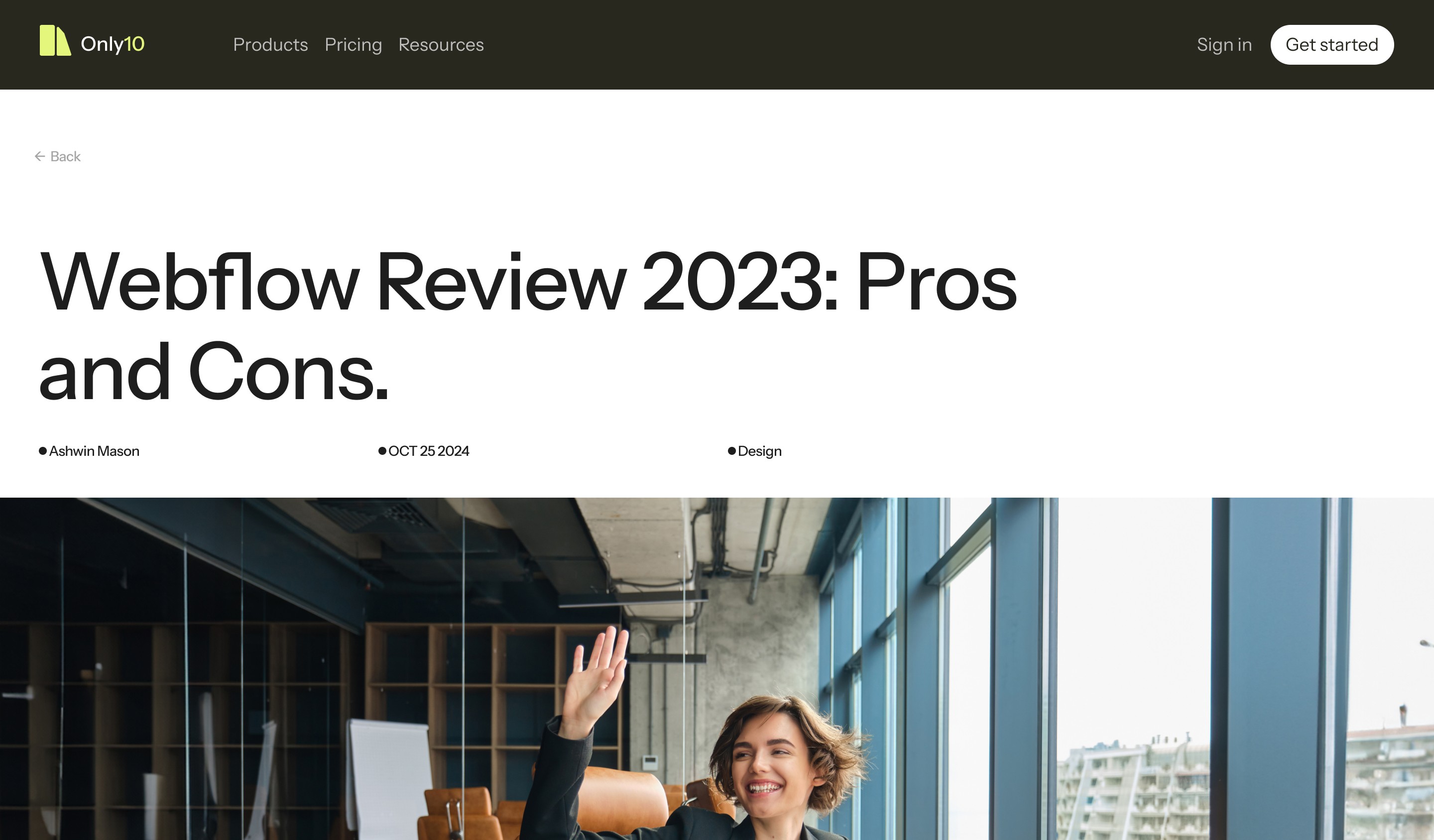
Only10 as well need a well-designed and optimized blog structure for different types of post.
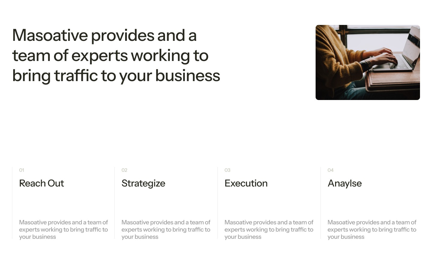
Strategy
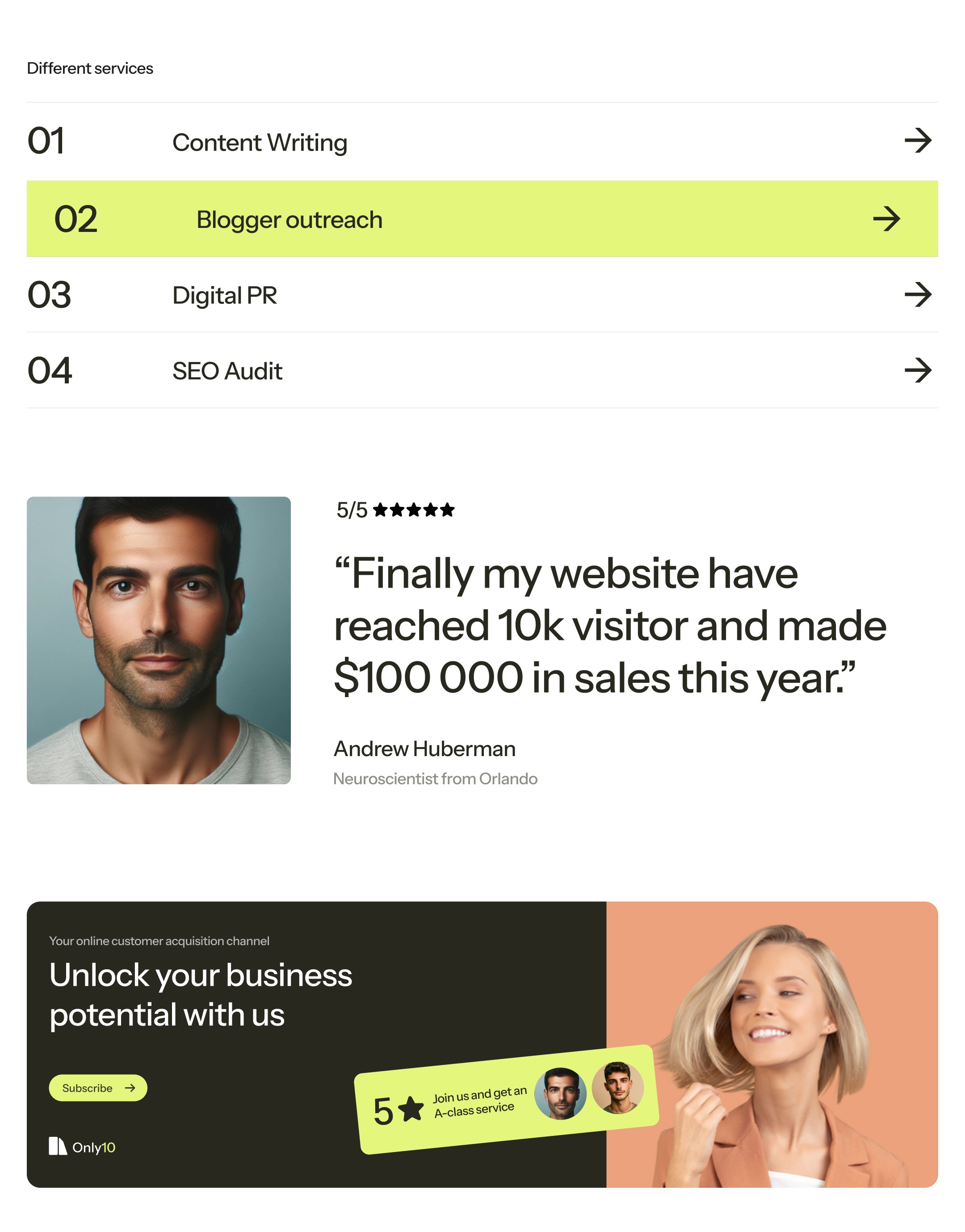
1. Radical Simplicity
Instead of asking “what should we add?”
We asked:
“What can we remove?”
Every element was evaluated based on:
Does it help the user decide faster?
Does it reinforce the core message?
Does it deserve one of the “10 slots”?
If not—it was cut.
2. Content as Hierarchy
With only 10 items allowed, prioritization became the strategy.
Top-tier content → immediate visibility
Supporting content → structured flow
Everything else → eliminated
This forced intentional storytelling, not just layout design.
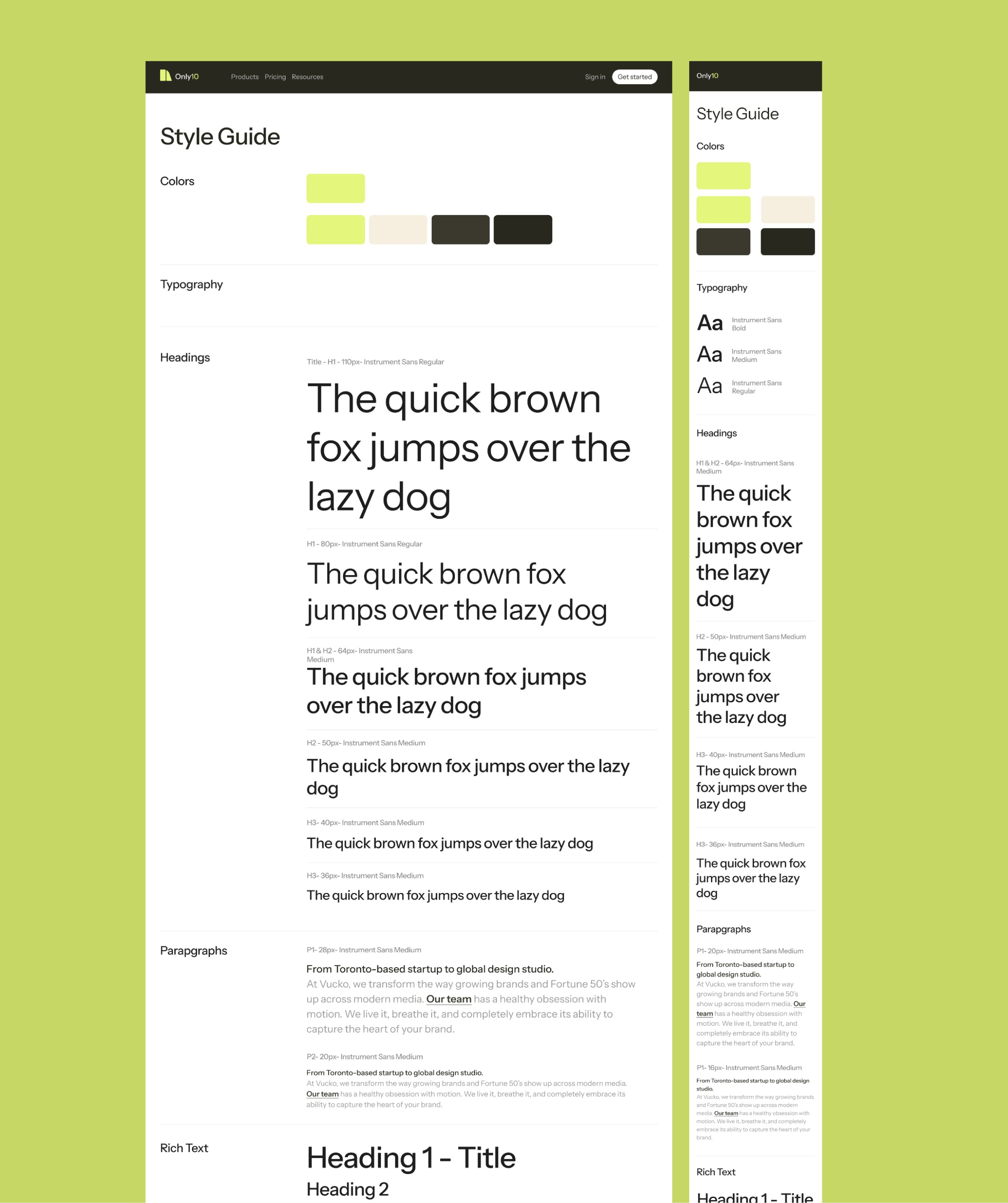
3. Built on a Flexible System
The project leveraged the MOSS Webflow template, known for:
Clean UI/UX structure
CMS-driven case studies
High-performance, responsive layouts
Instead of reinventing the wheel, the focus was:
👉 Customize the system
👉 Push its boundaries
👉 Remove unnecessary complexity
4. Interaction as Reinforcement
Animations and interactions weren’t decorative—they served a purpose:
Guide attention
Reinforce hierarchy
Create rhythm between sections
No “cool for the sake of cool.”


