
Overview
Custella (former FieldEx) wasn’t broken.
But it wasn’t winning either.
Despite having a strong product, the brand lacked clarity, authority, and memorability in a crowded field service management (FSM) market. It felt generic. Interchangeable. Easy to ignore.
The rebrand to FieldEx wasn’t just a name change; it was a complete repositioning of the company’s identity, perception, and growth engine.
This case study breaks down how I led the transformation across:
Brand strategy
Visual identity
Messaging
Website (Webflow)
Demand generation foundation
The Problem
Custella had four core issues:
Weak market positioning
Generic brand identity
Poor conversion infrastructure
Little to no SEO
The Goal
The mission was simple, but ambitious:
Turn Custella into a brand that looks, feels, and performs like a category leader.
Specifically:
Build a memorable, category-aligned brand
Create a scalable design system
Develop a conversion-focused website
Lay the foundation for predictable demand generation
The Strategy
We approached this in 3 layers:
1. Reposition the Brand
Make the product instantly understandable.
2. Build a Cohesive Identity System
Design something scalable across:
Web
Sales
Product
Marketing
3. Turn the Website into a Growth Engine
Not a brochure—an acquisition machine.
The Rebrand: Custella → FieldEx
Why “FieldEx”
The new name had to do two things:
Anchor the brand in the field service category
Feel modern, scalable, and global
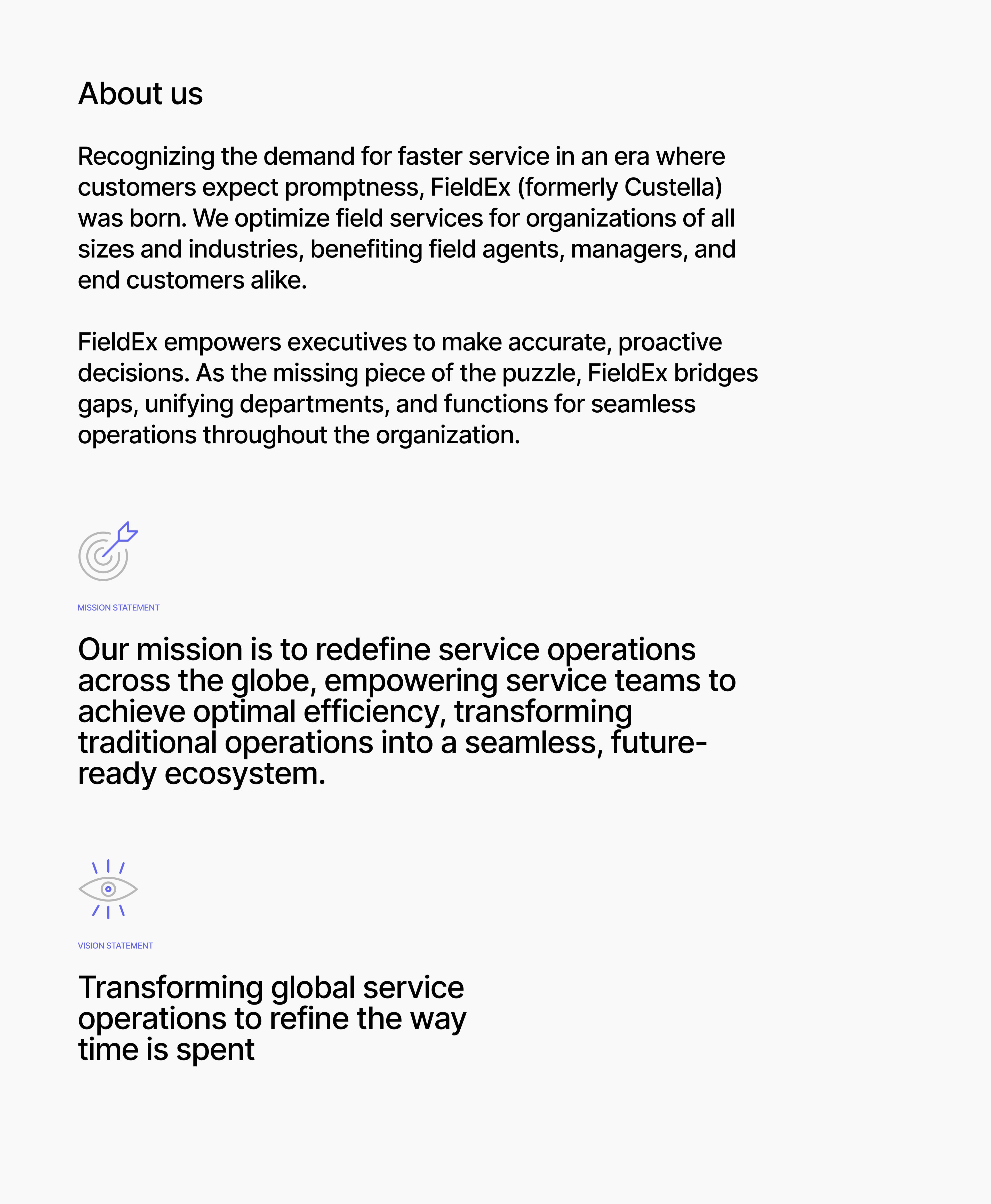
FieldEx = Field Execution / Field Excellence
It immediately communicates:
What the product is about
Who it’s for
What it enables
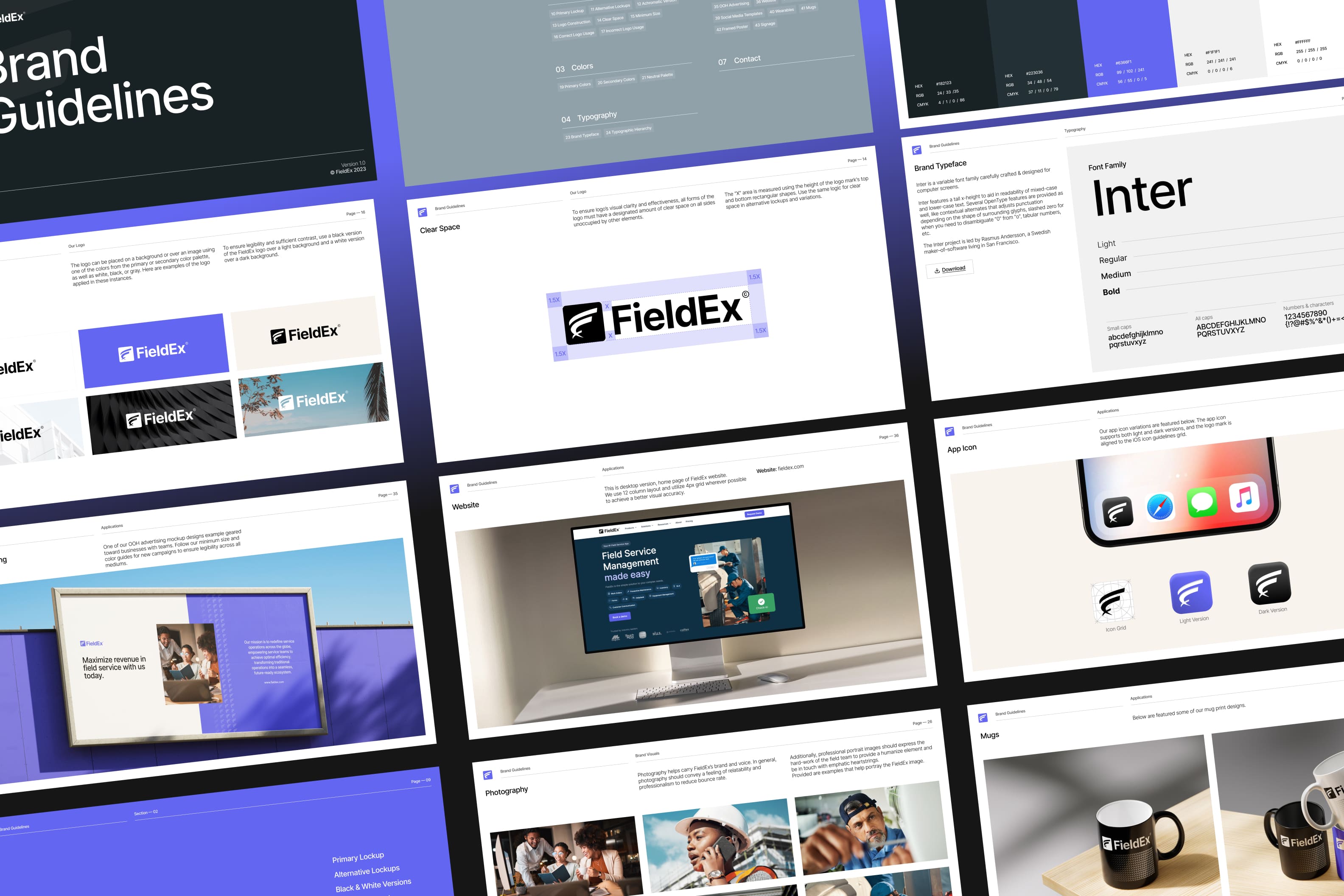
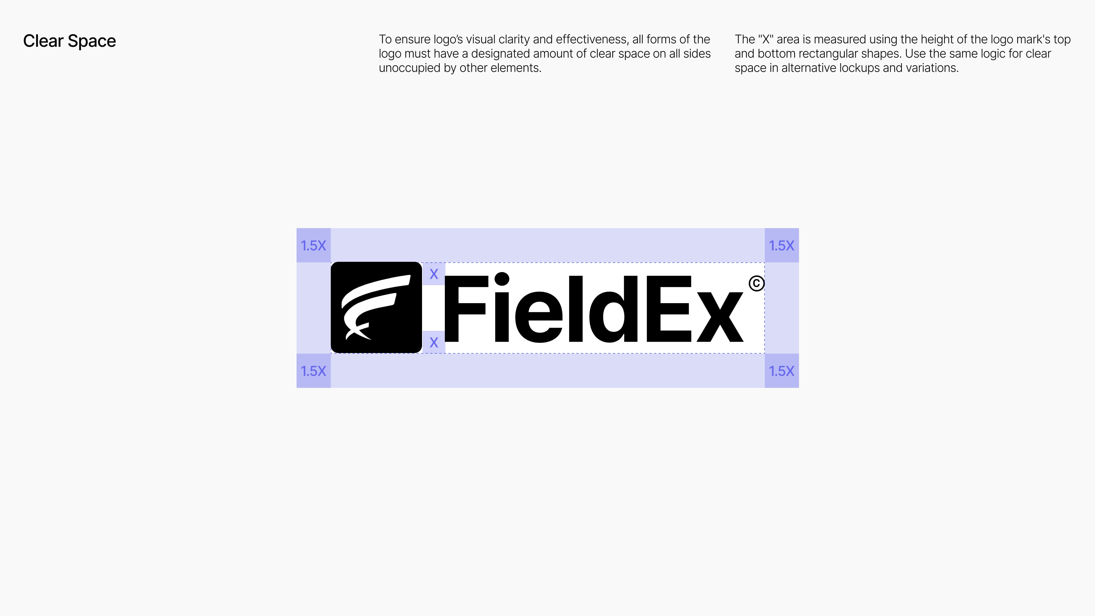
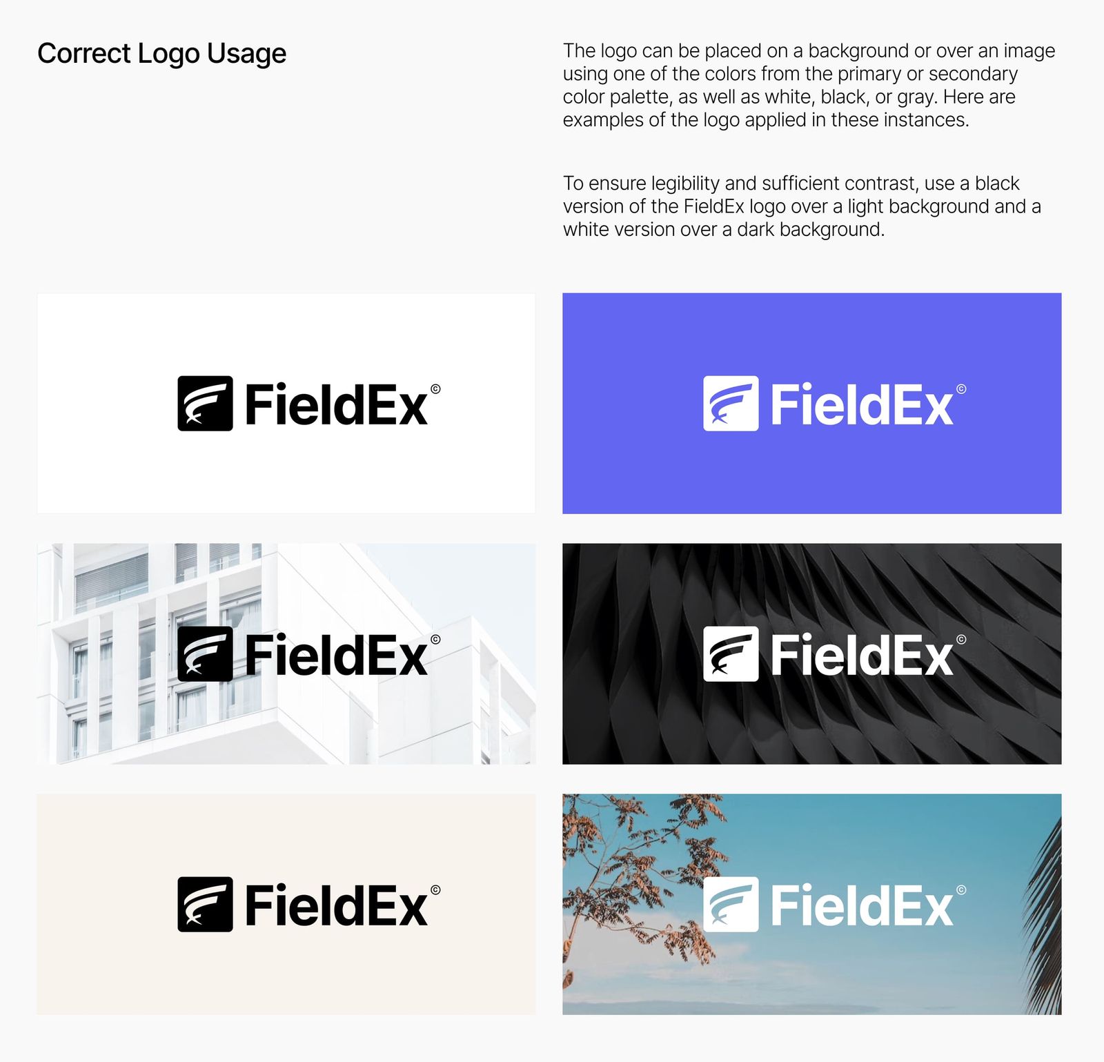
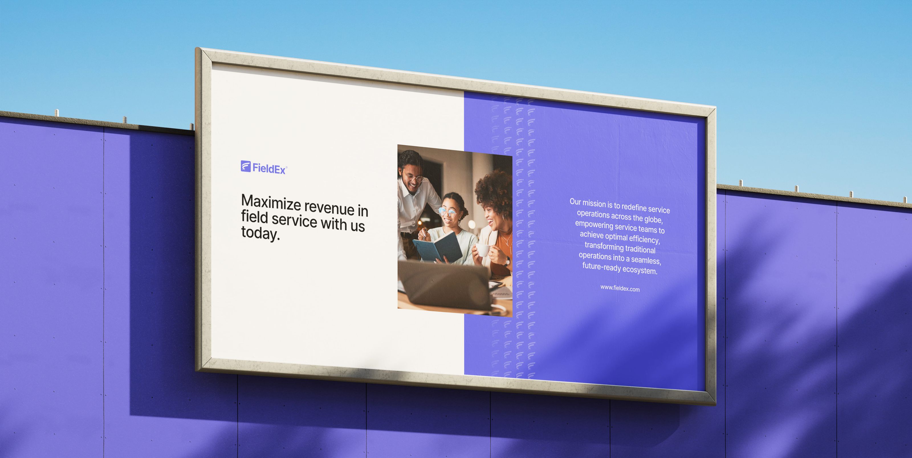
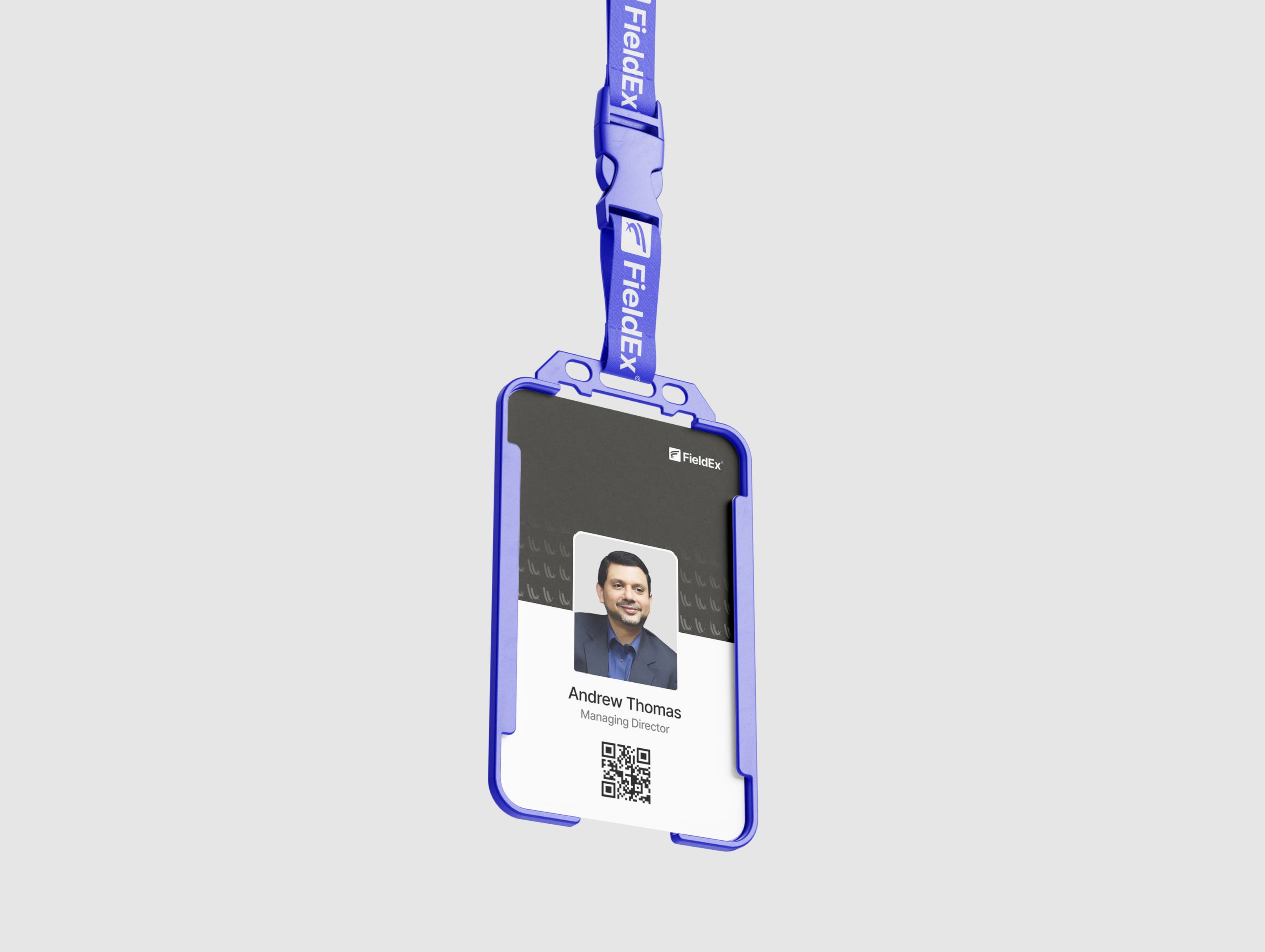
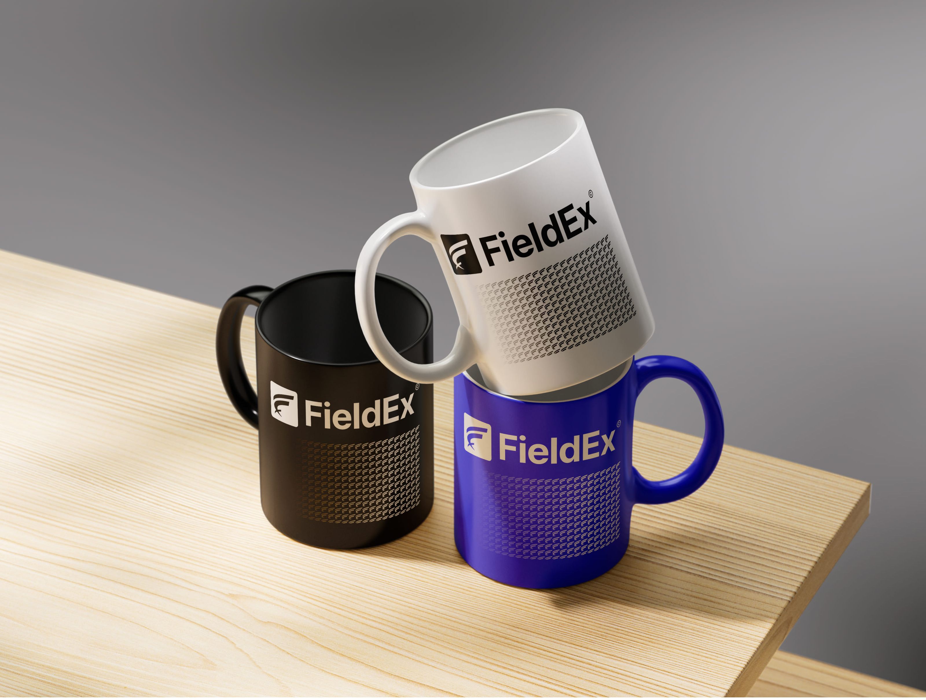
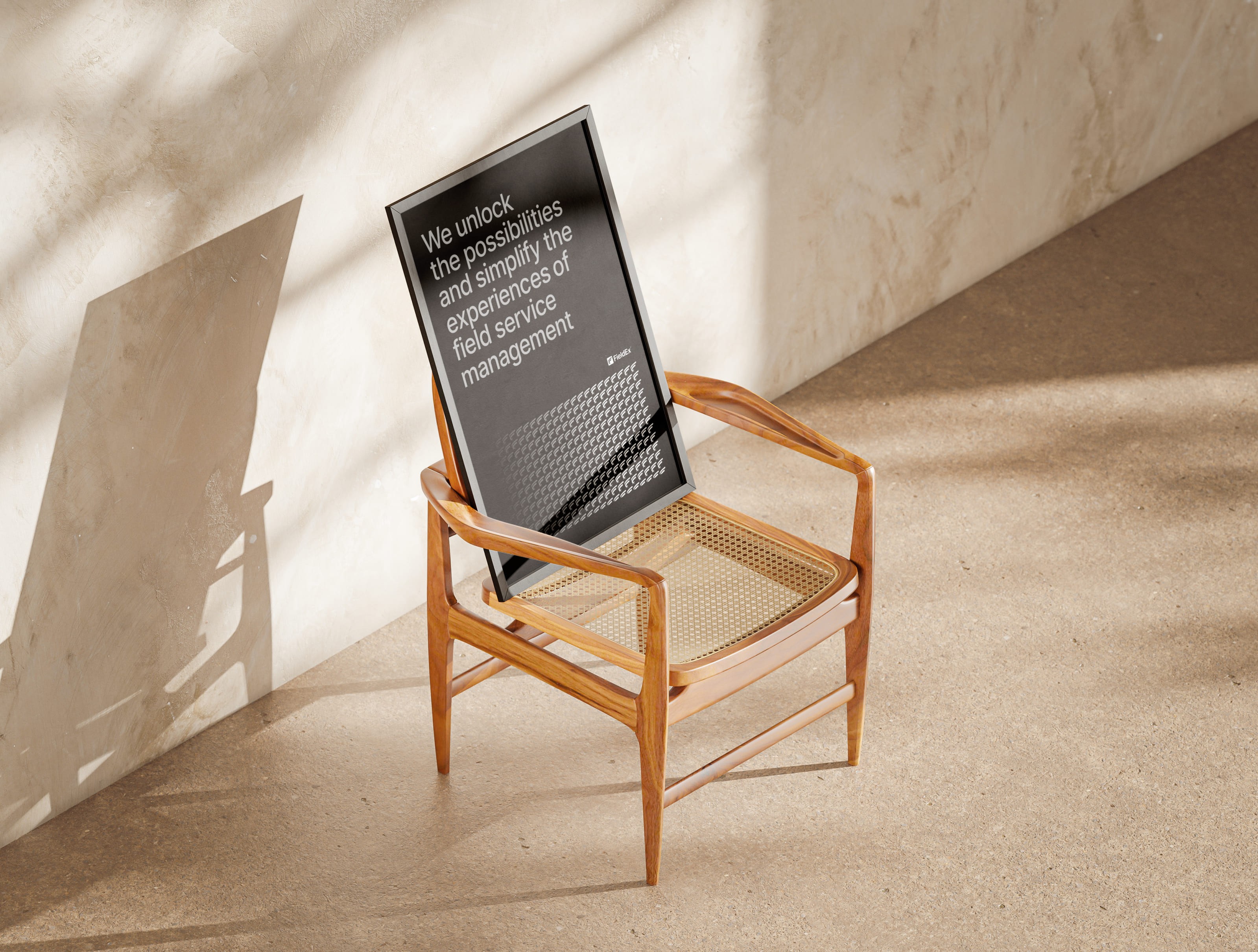
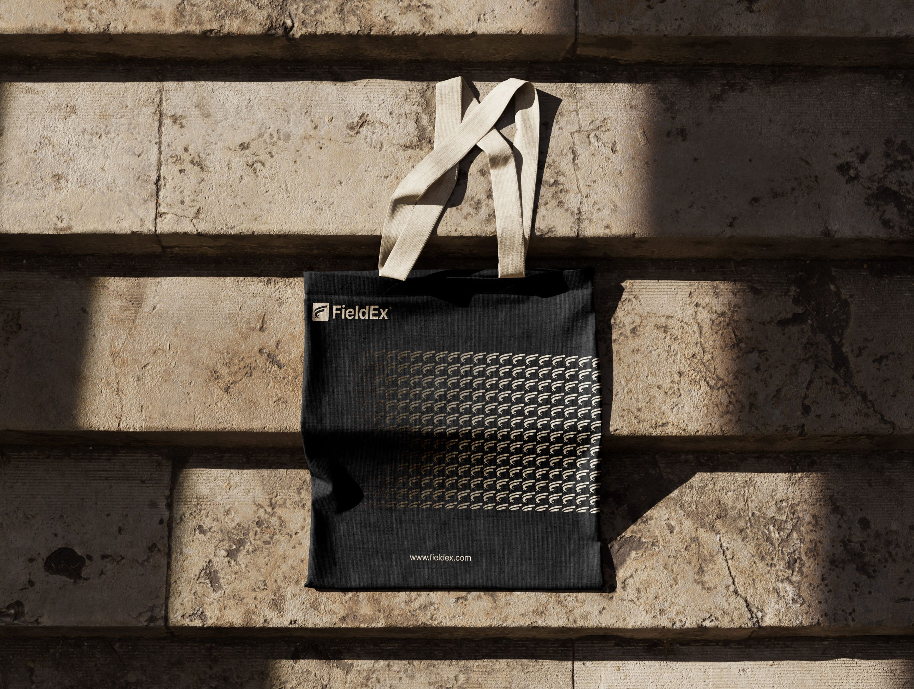
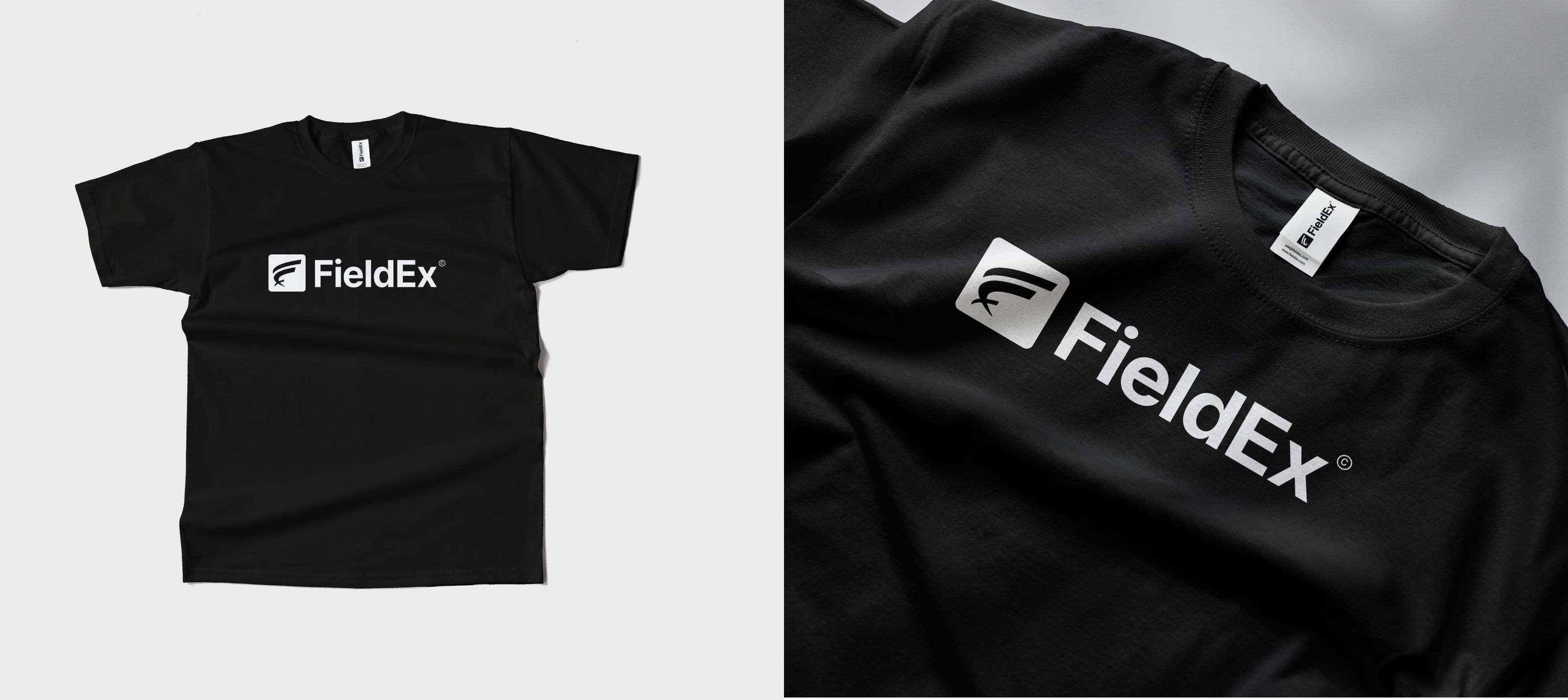
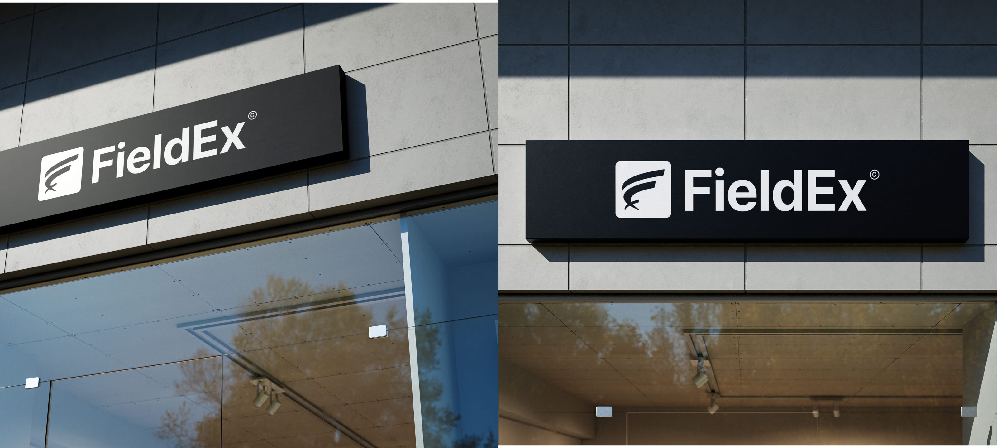
Brand Identity System
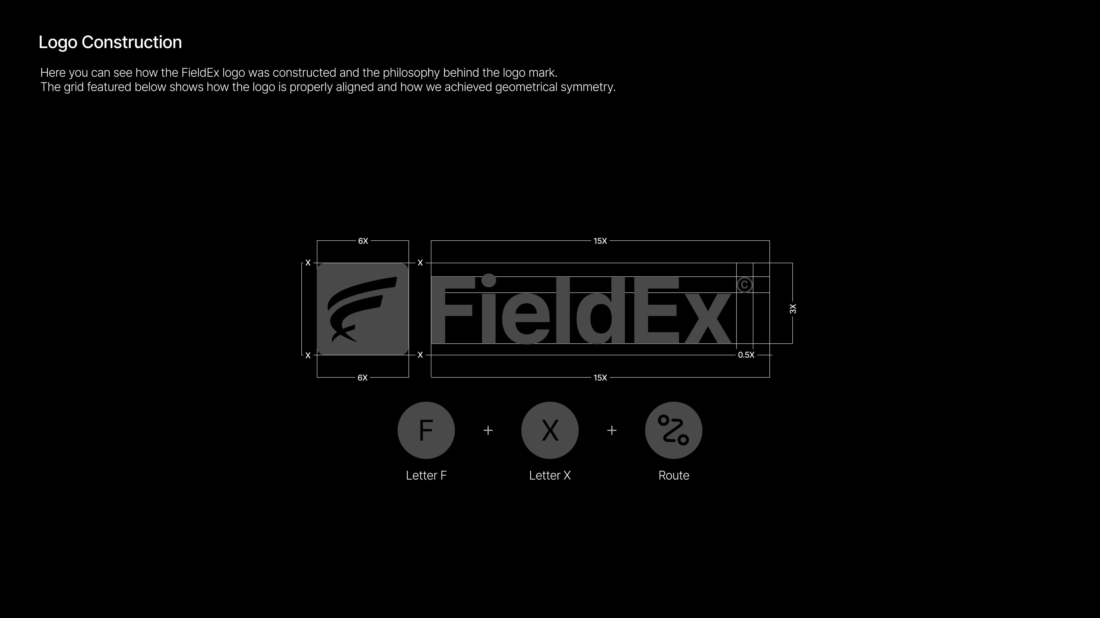
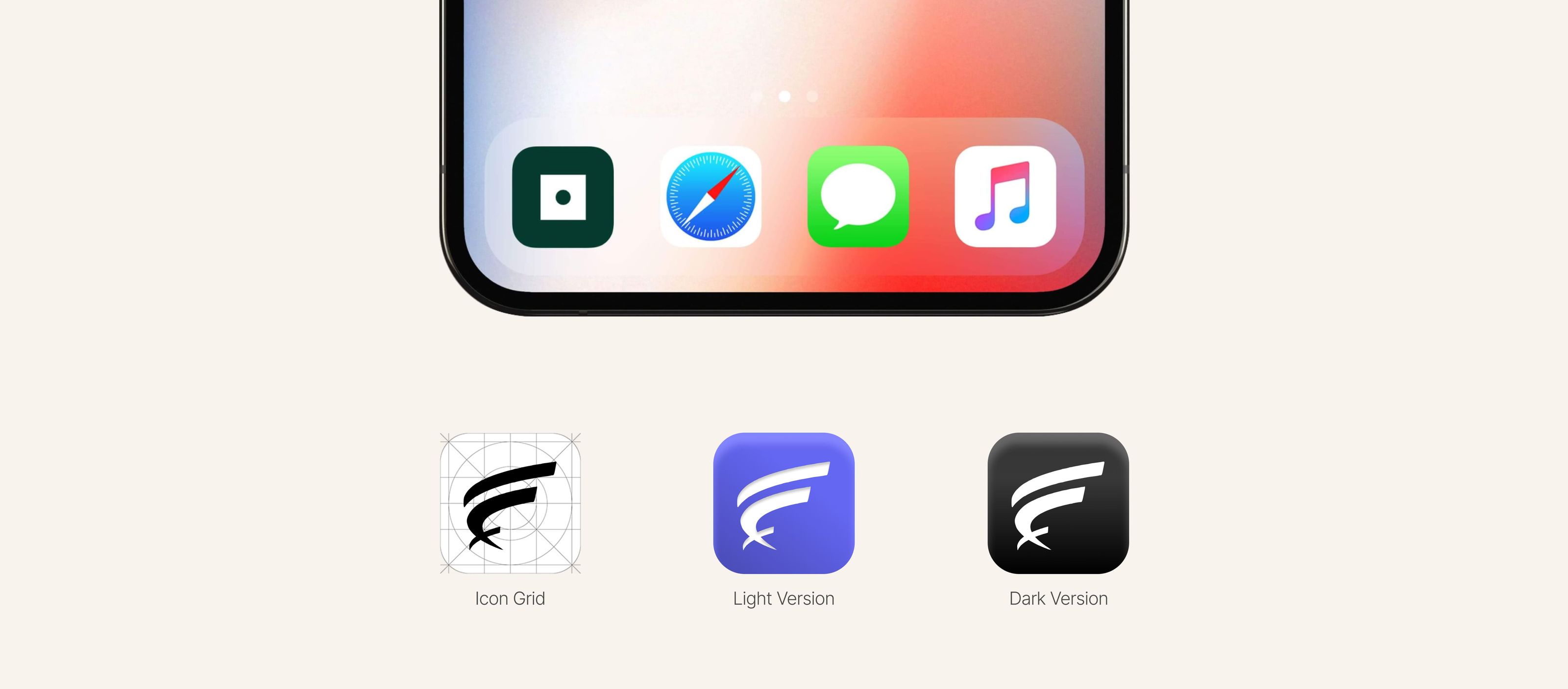
Logo Design
The FieldEx logo was built with intentional geometry and meaning
Combines F + X + route/movement symbolism
Represents:
Motion
Precision
Field operations
The result: a mark that feels operational, structured, and dynamic.
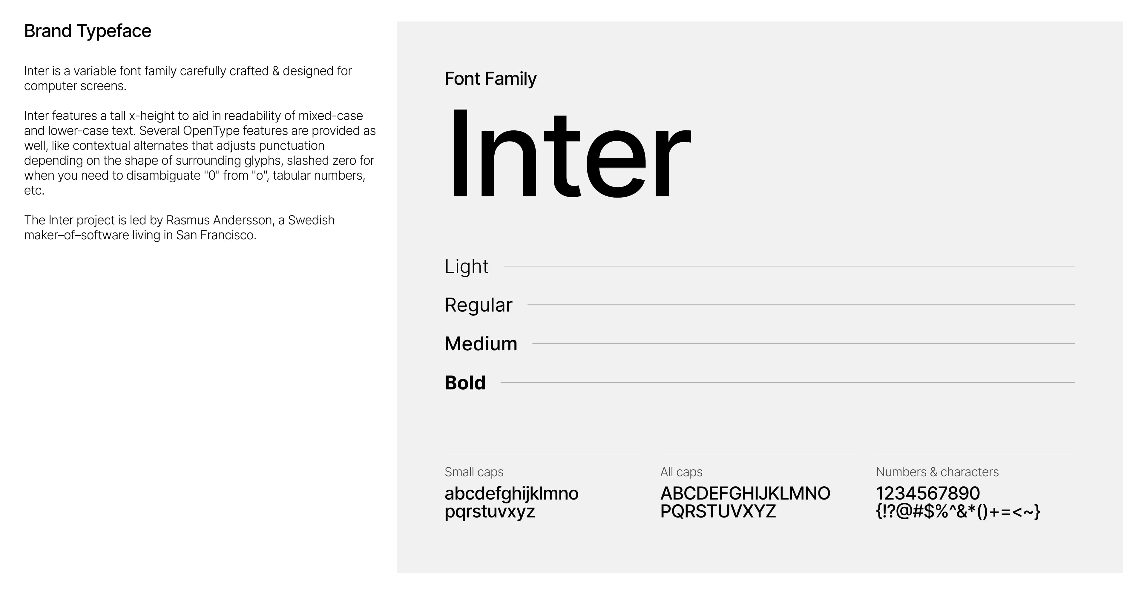
Typography
The brand uses Inter
Why this matters:
Highly legible across devices
Neutral but modern
Scales well from UI → marketing
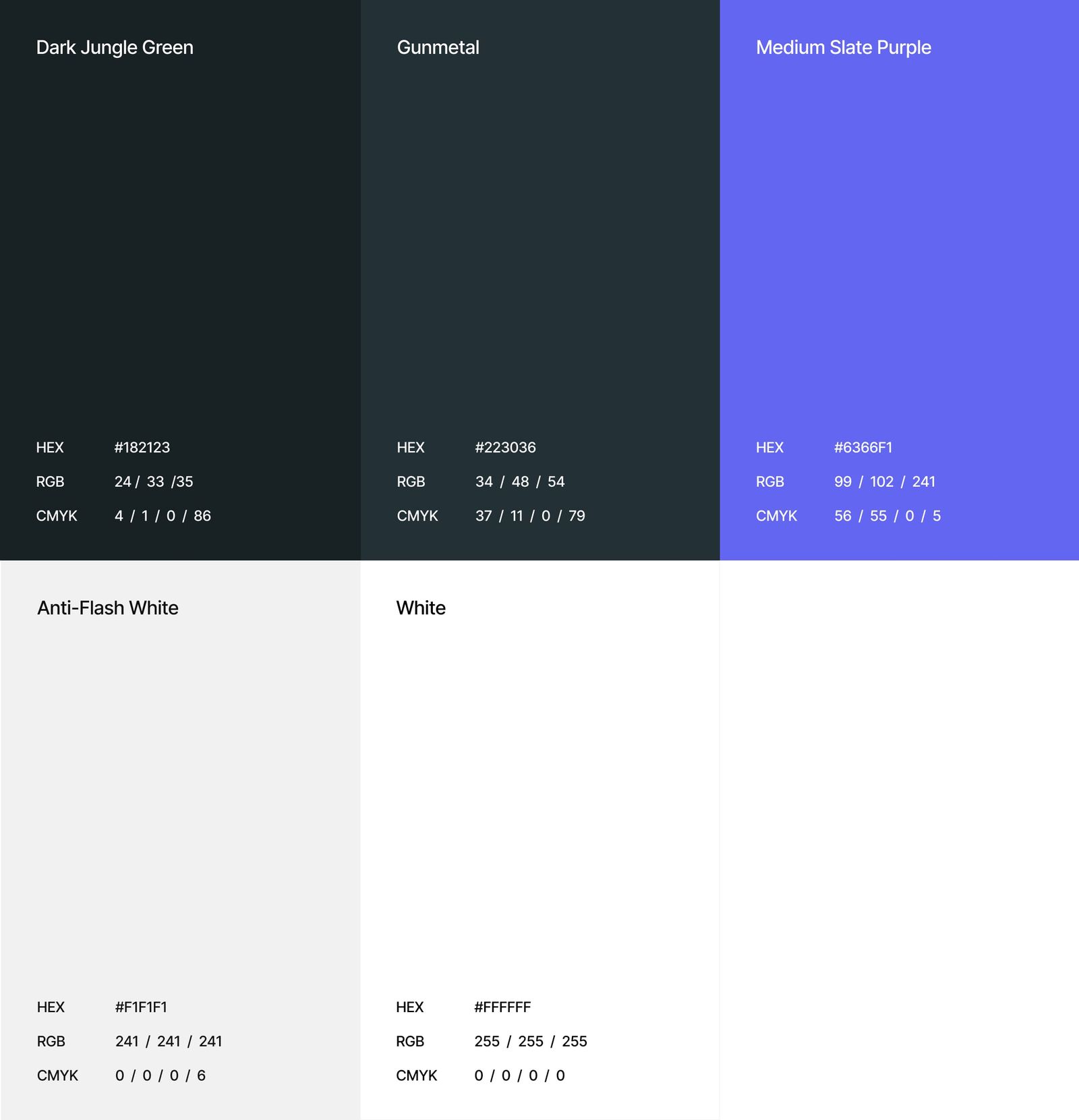
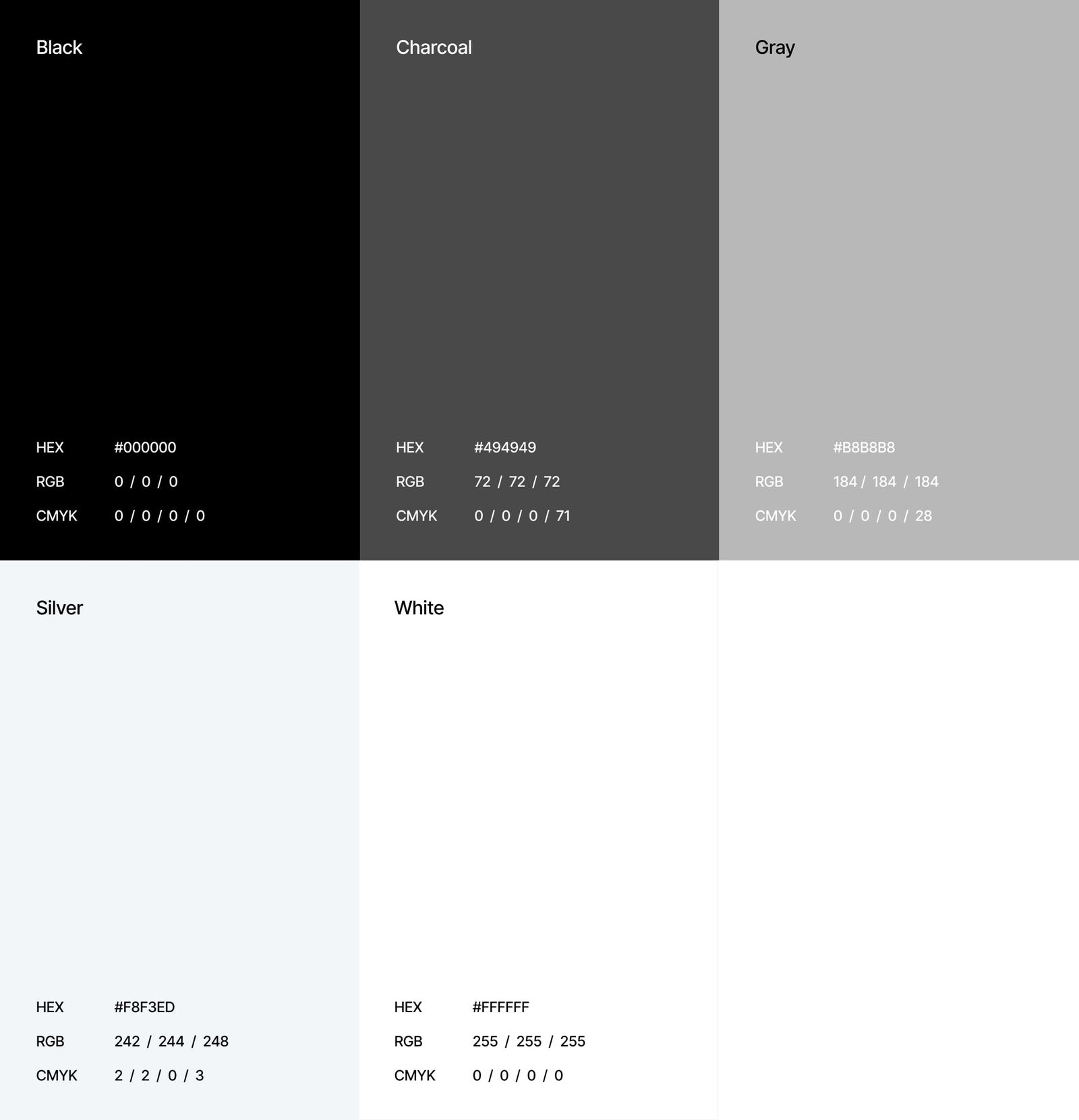
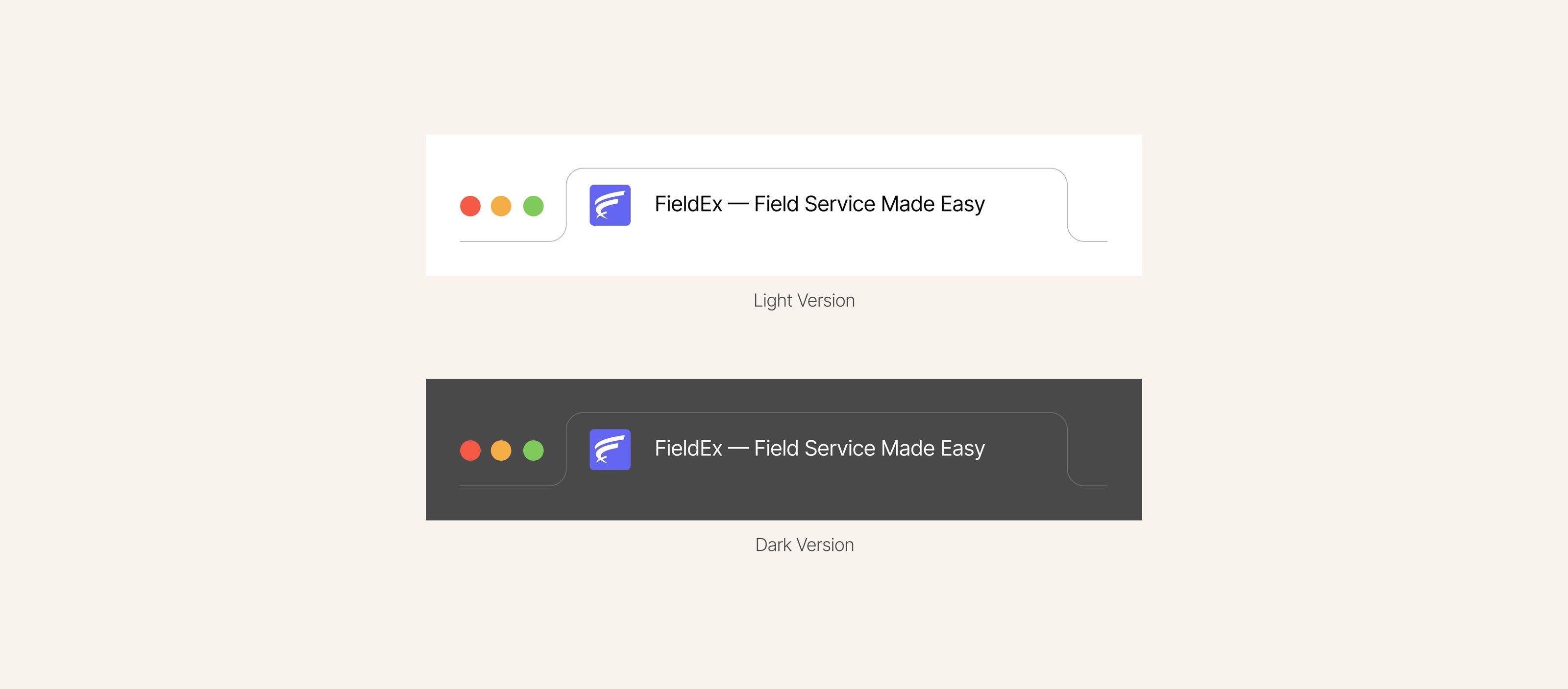
Color System
Primary palette includes:
Dark Jungle Green
Gunmetal
Medium Slate Purple (accent)
Supporting neutrals:
Black, Charcoal, Gray, White
Strategic intent:
Dark tones → authority, enterprise feel
Purple → differentiation + memorability
This balance allowed the brand to feel:
Serious enough for enterprise, distinct enough to stand out.
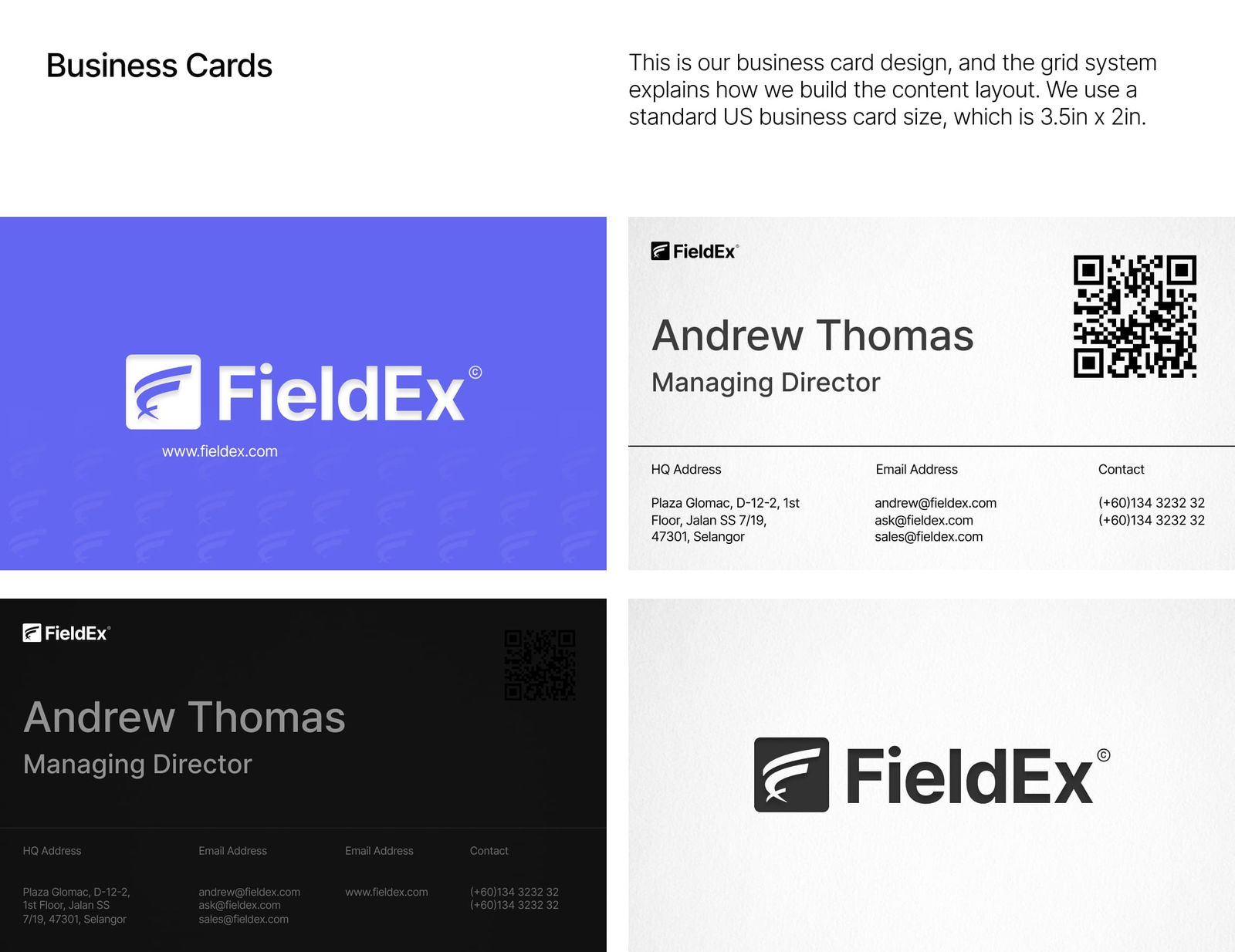
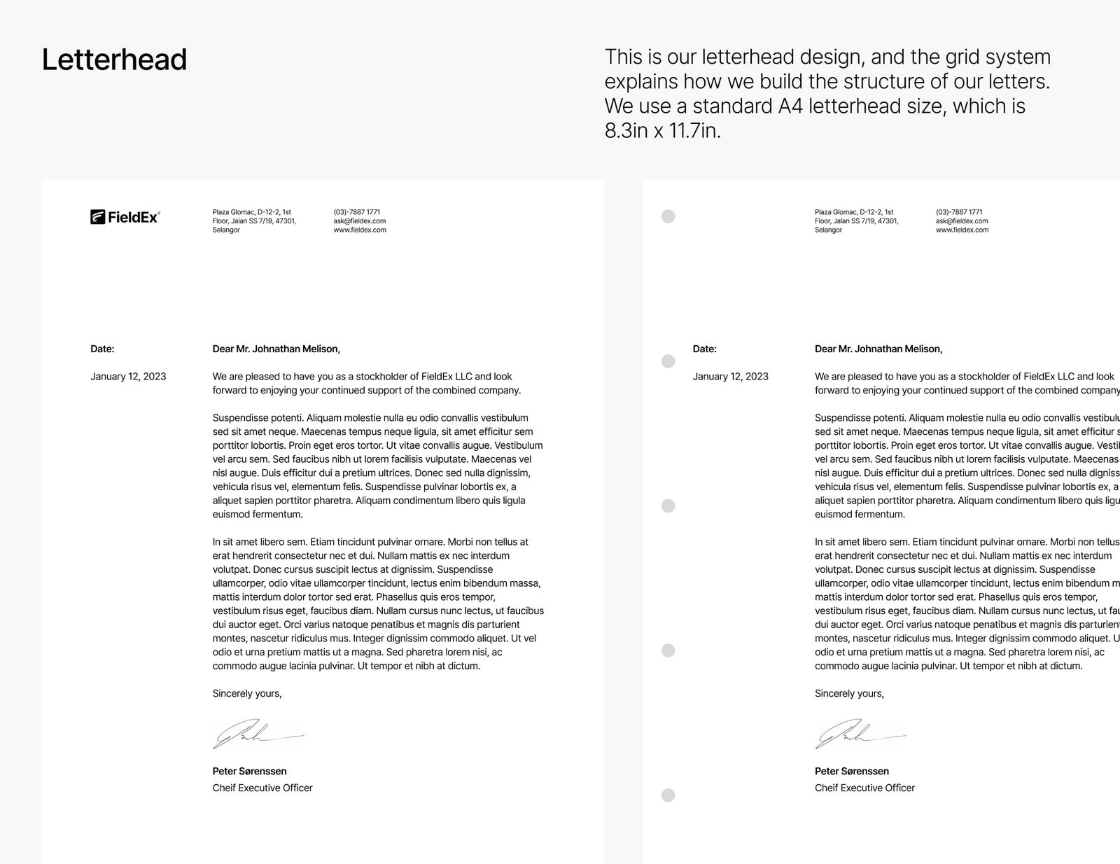
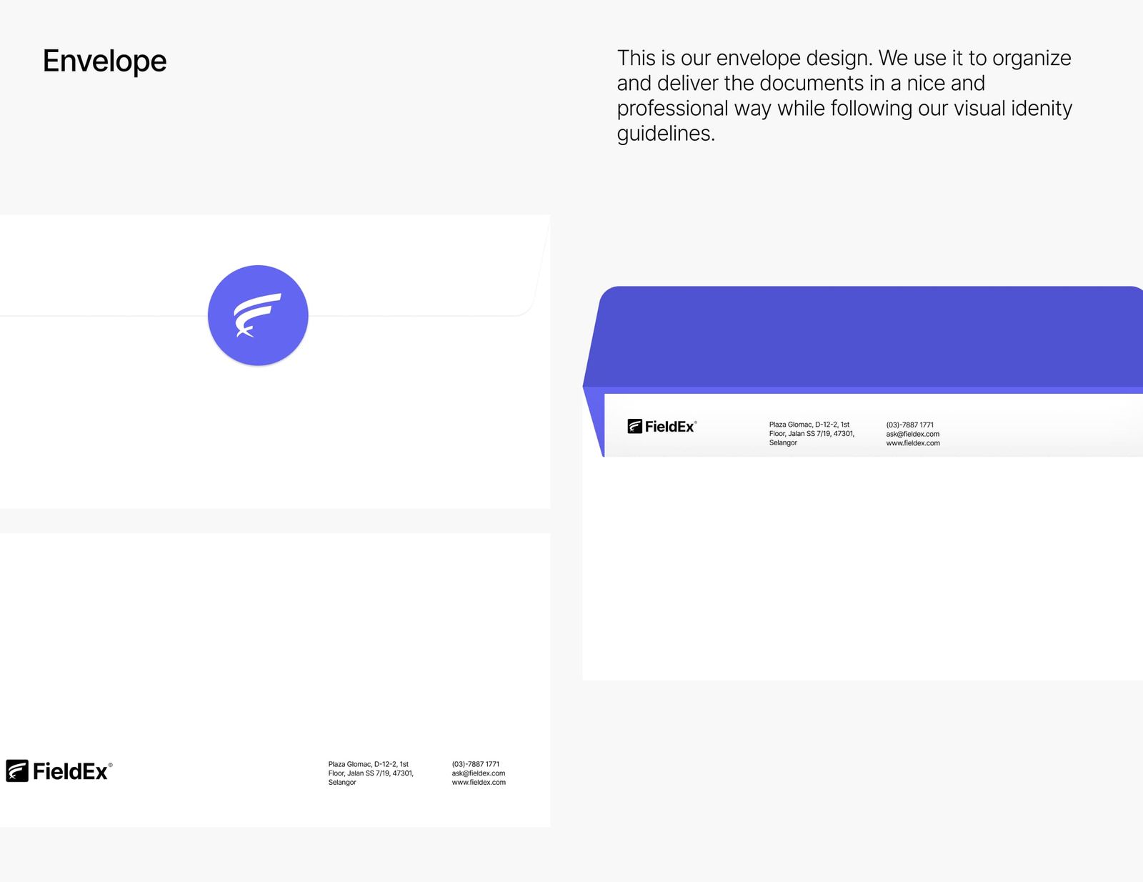
Visual Language
The system extended across:
Business cards
Letterheads
Envelopes
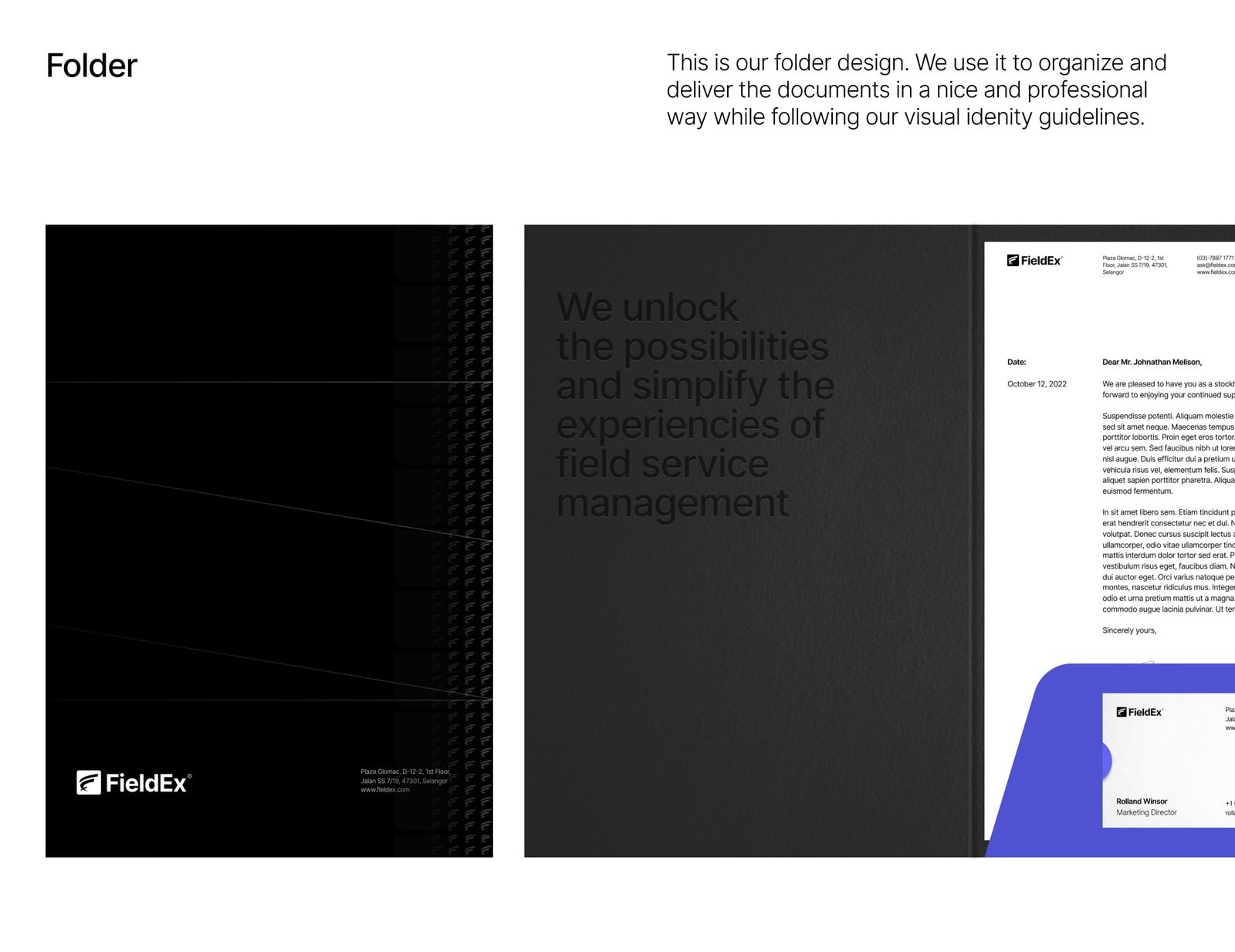
Folders
App icons and UI elements
Everything followed:
Strong grid system
Clean spacing rules
High contrast usage
Consistency wasn’t aesthetic; it was strategic.
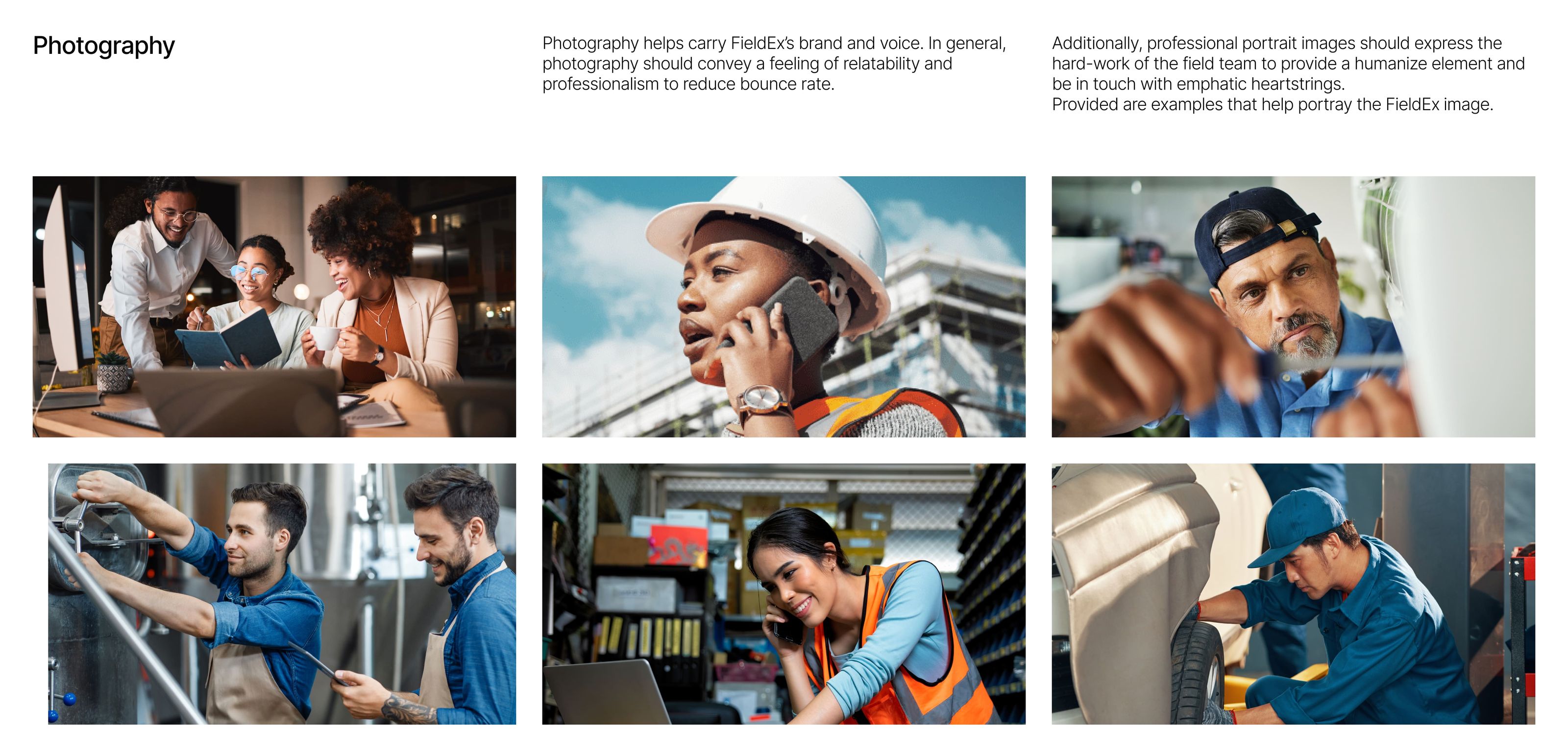
Photography Direction
Real field workers
Real environments
Human-centered visuals
This grounded the brand in reality:
Not software-first. Field-first.
Website: From Brochure → Growth Engine
The website redesign was where strategy met execution.
Before:
Generic messaging
Weak structure
No SEO foundation
Low conversion clarity
After:
A complete rebuild in Webflow focused on:
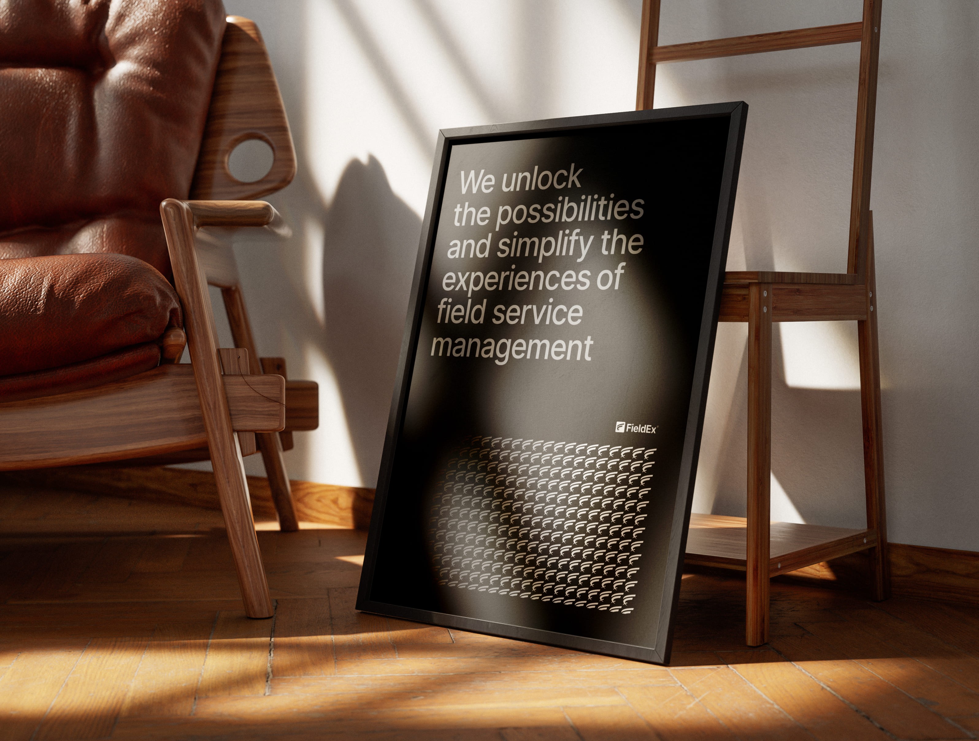
1. Clear Value Proposition
Hero messaging
“Field Service Management made easy”
Simple. Direct. Outcome-driven.

2. Structured Information Architecture
Built around:
Use cases
Industries
Features
Conversion paths
Each page had a job:
Rank
Educate
Convert
3. Conversion-First UX
Every section answered:
What is this?
Why should I care?
What do I do next?
With:
Strong CTAs
Clear hierarchy
Minimal friction
4. SEO as a Foundation
The site wasn’t just designed; it was engineered to rank.
Programmatic SEO structure
Keyword-driven pages
Scalable CMS architecture
This turned the website into:
A compounding acquisition channel.
Additional materials
Closing
This wasn’t a rebrand.
It was a transformation from:
“Just another FSM tool” → “A serious category contender.”
And the biggest shift?
Before:
We had a product looking for attention.
After:
We had a brand that demanded it.


